Your clients’ shoppers want mobile-friendly sites more than ever, according to a Google survey. This is backed up by what device shoppers use the most when making purchases. According to Search Engine Watch, 60% of shoppers are now exclusively using mobile devices to make buying decisions. A separate Shopify study of its own ecommerce platform determined that more than 50% of e-commerce traffic now comes from mobile.
Bottom line: As a designer, you must be designing with mobile first in mind at all times, or risk getting left behind by potential clients who want their online stores to be mobile-friendly.
One of the best ways to ensure a site is mobile-friendly and, by extension, offers better UX is by speeding things up. Mobile experiences should be characterized by fast page load times to make it easy for shoppers to find what they want and encourage them to stay on the site longer.
The three-second rule
When it comes to fast speeds on mobile devices, the number three has extra-special significance. According to the Huffington Post, mobile shoppers will abandon a website if it takes more than three seconds to load. Yikes! Mobile users are the most instant gratification-minded consumers on the Internet, so you have to design based on the user experience they want.
This stat shows that mobile users are hungry for fast mobile experiences. It also means that merely having a mobile site, app or hybrid just isn’t enough — building a fast mobile site is front and center to the mobile-friendly experience.
When your client’s shoppers enjoy a better mobile user experience, they’re more likely to convert and buy from a site. The site’s speed, then, doesn’t just have implications for the user experience, but, from your client’s perspective, the bottom line of his business.
Here are four killer tips to turn your client’s mobile UX into one fast experience.
You might also like: You Can Now Build a Complete Ecommerce Store On Any Website or Mobile App
Mobile UX Tip #1: Include only essential page elements
Again, we talk about minimalism in mobile UX design, and with good reason. Whether you’re on a phone or tablet, the screen size is so much smaller than a desktop that you are just better off restricting any inessential elements from going into your final mobile design.
You can achieve this by reducing the overall total page elements, whether they’re images, site copy, forms, tracking tokens, CSS, JavaScript, etc. Remember that you should be compressing, combining, or getting rid of elements altogether whenever possible.

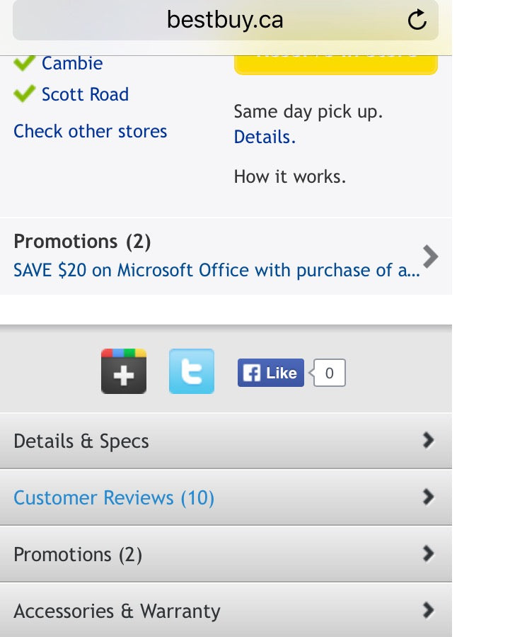
One mobile site that loads quickly in under three seconds is Best Buy. Naturally, its designers have implemented this minimalism-first approach to its mobile user experience. Looking at the average product page, we see that images and copy are kept to a minimum, with important sections for specs and details actually opening up in entirely new mobile pages.
You might also like: Using JQuery Image Zoom and JavaScript Zoom for Product Images on Shopify.
Mobile UX Tip #2: Watch your image size
Continuing with the theme that smaller is indeed better for mobile screens, keep your image sizes smaller, too.
You can make your client’s site more viewable in mobile by first opening the site in a desktop browser window and setting it to its narrowest width, so that it’s still readable. Then, you take the size of this minimum viewing window and set it as your mobile site’s preferred viewport width. As a result, the images will automatically be too big on mobile and need to be made smaller for a better user experience.
To adjust the images, just give the mobile images a maximum width of 100%, which will make them resize to fit the smaller mobile screen if they’re too big for any mobile device. Add this command to the mobile site’s CSS stylesheet.
It’s greatly helpful never to lose sight of the screen size for which you’re designing. In the worst-case scenario, you’re designing for a screen the size of a playing card (phone), but even tablet screens are far smaller than desktop screens.
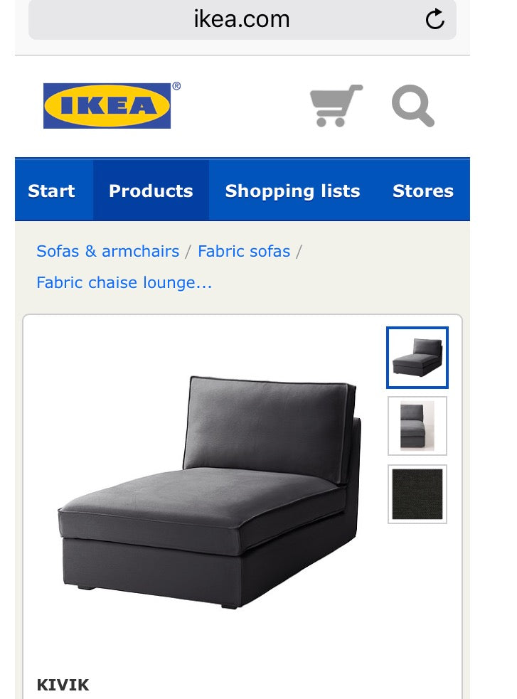
Ikea’s site also loads faster than three seconds, making it a great example of speed in the mobile user experience. Because of these adjustments to make images smaller on its mobile site, note how Ikea’s product page images are actually less clear when they’re standard size. It’s only when shoppers zoom in on them that they get sharper and easier to see.
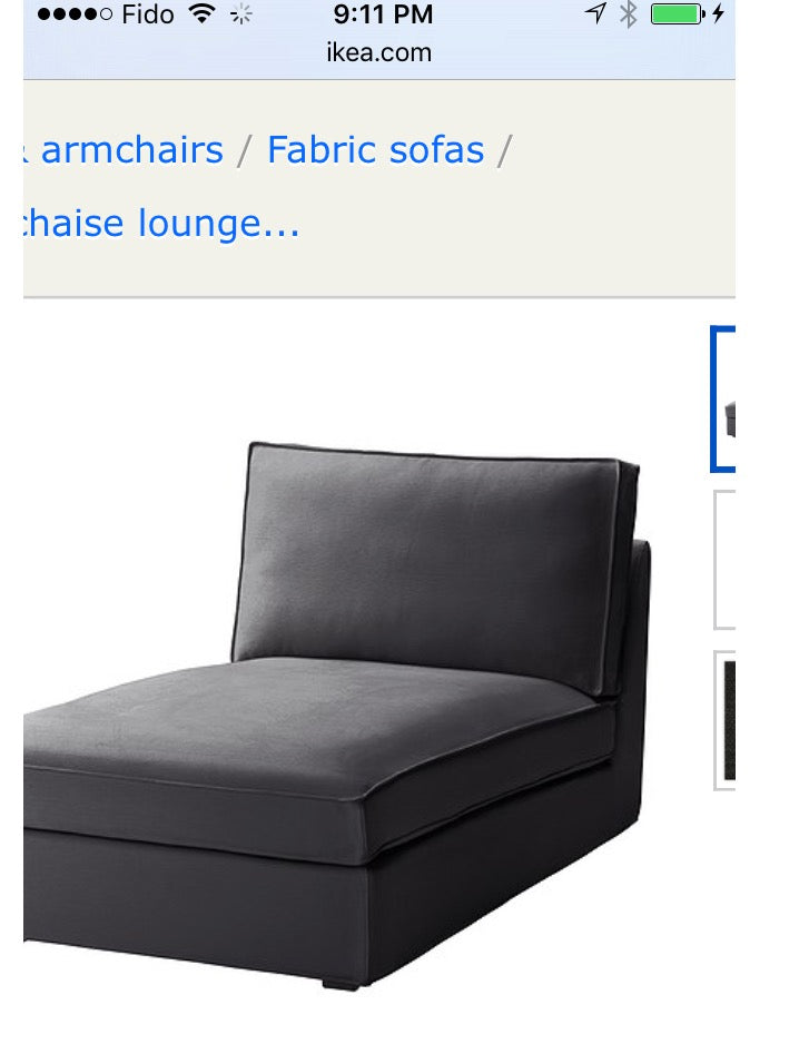
The point is that small sacrifices like this have to be made to ensure a faster and, therefore, better overall mobile user experience. Nonetheless, users are easily able to get around this minor issue by zooming in on the screen with their fingers, which allows them to see the products in the images in very good sharpness, which ultimately helps their purchase decision.
You might also like: 5 of the Best Prototyping Tools to Test Out Your Web and Mobile Designs
Mobile UX Tip #3: Eliminate redirects
What are redirects? They’re instructions that immediately take visitors from one file to another file or location. While they can be achieved in various ways, here’s the rub: either way hurts your page speed! That’s why it’s recommended that designers optimize or, better yet, remove them altogether.
According to SEO expert Patrick Sexton, redirects make it longer for your client’s site visitors to get to the pages they want to arrive at. That’s because they’re always being redirected…instead of being straightforwardly directed to the page they want. The more redirects your mobile site has, the slower it will be. The rule of thumb is that redirects typically use more client-side processing.
Patrick likes to use the following procedure to remove redirects:
-
Locate the redirects first (tools like Redirect Checker and Redirect Mapper are useful)
- Figure out why the redirect is there
- Analyze how it either affects or is impacted by other redirects
- Remove it if it’s not necessary (it’s likely not necessary)
- Update it instead if it either affects or is affected by other redirects
- Remove the redirect by using HSTS, if your site is secure
Retailer Crate and Barrel also has a mobile site whose pages constantly load in no more than three seconds. The mobile site’s fast speed indicates that it has its redirects under control.

Mobile UX Tip #4: Rely on Responsive Design
Today, responsive design is a mainstay of web design, and with good reason. That’s impressive when you consider that the phrase “responsive design” was coined just a few years ago by Ethan Marcotte.
It can single-handedly increase your client’s mobile site’s user experience to the point that you get measurable results of improvement. Studies have shown that making a mobile site responsive — instead of just making an optimized mobile site that’s based on the original desktop site — really boosts conversion rates.
Responsive design is when there’s just one site, but it renders perfectly and seamlessly on both desktop and mobile sites. If your client isn’t the biggest company in the world and therefore has a smaller budget and/or limited resources, then responsive design can be an elegant and effective solution to speeding up the mobile user experience.
This is because all the money and effort spent on monitoring and updating the site can be put into one site instead of a dedicated desktop and mobile site, respectively. Look at it as the two-birds-with-one-stone solution to building a better user experience.
According to About.com, your client should expect to budget approximately $750 for a responsive site design that handles mobile phones, tablets, and desktops seamlessly. Beyond that, it’ll cost an additional $150 for every device size — such as tablets in both landscape and portrait views — not covered by the basic three sizes.
Costco’s mobile site is another great example of a blazingly fast mobile experience. In keeping with the best practices of responsive, its desktop site morphs into its mobile site by changing the following on the homepage:
- Fly-out mega menu on left side of page becomes a hamburger menu
- Decrease in number of images and site copy
- Single-column design takes up entire page instead of just middle column<
Here's what Costco's site looks like on desktop:

And here's what it looks like on mobile. As you can see, the mobile user experience is great and won’t repel shoppers.

Toward a faster mobile UX
Shopping on mobile — it’s getting more and more popular. People want to shop when they’re taking transit home from work or as they wait in line. As these user behaviors are becoming more noticeable and reported, it’s vital that designers follow this trend to design mobile user experiences that are useful, convenient, and relevant to shoppers.
One of the most effective ways of accomplishing this is by making your mobile site as fast as can be. Remember the three-second rule: shoppers get frustrated and drop off a site if its pages take more than three seconds to load! Please and delight your client's customers by consistently designing mobile sites whose pages load in less than three seconds. Your clients are counting on you for greater conversions and sales on their online stores.
Improving the mobile user experience comes down to a few, specific strategies that, if you do them right, will be very rewarding for shoppers and your clients. Here are the huge takeaways for fast mobile user experience design to remember from this article:
- Include only the most essential mobile page elements
- Shrink image sizes
- Get rid of redirects
- Use responsive design
What do you do to design a better mobile UX? Share your favourite tips in the comments below.
Read more
- Content Strategy: The Principles we Followed to Build the New Shopify App CLI
- 10 Ways to Improve User Engagement for Your App This Valentine's Day
- The Use of Color Contrast in Mobile Ecommerce Design
- 5 Common Digital Content Problems and How to Avoid Them
- How to Use Eye Tracking in Usability Tests
- Principles of Product Design: Learn Fast, Guess Less
- How To Harness The Power of Process Mapping
You might also like: 5 Simple Hacks for an Optimized Mobile Ecommerce Design

