As the owner of a small retail store, you might have grand plans for your retail design, only to find out that it isn’t practical. You don’t have the luxury of thousands of square footage; every inch needs to be meticulously planned to maximize space.
If you’re stuck for ideas on how to make a small space more visually appealing, this guide is here to help. We’ll share 20+ of the best design ideas and trends for small brick and mortar stores, designed to increase visual appeal—and most of them are completely free to do.
21 design for small store ideas
- Leverage vertical space with high shelves
- Maximize product visibility with cross-merchandising displays
- Use multipurpose furniture
- Choose a neutral color palette
- Use varied lighting options
- Incorporate mirrors to expand visual space
- Adopt an open floor plan
- Create a natural loop
- Opt for mobile fixtures
- Create a focal point
- Use clear glass for windows and doors
- Display products in the window
- Create seasonal displays
- Optimize underused areas
- Use display screens
- Create an accent wall
- Use baskets and bins
- Show QR codes
- Create social media opportunities
- Play music in-store
- Optimize employee areas
1. Leverage vertical space with high shelves
Square footage is a limiting factor when you’re designing a small shop, but depending on the location you’ve secured, you’ll likely have vertical space to play with. This is where shelving comes into use.
Vertical shelving, like this example from elf ceramics, gives you more space to display your products without having to clutter the floor and design a messy store. It also allows you to create a planogram that shows products at eye level; people won’t need to crouch down to see what’s for sale. This is a prime position for high margin or best selling products since items at this height are easiest to see.

2. Maximize product visibility with cross-merchandising displays
How you arrange your products in-store influencers not only what a customer buys, but how much they’ll spend. Take grocery store Buehler’s Fresh Foods, for example. It struggled to sell cherry pitters, but once they were placed beside a fresh bag of cherries, they sold out in all 15 locations.
Cross-merchandising is a strategy that places similar or related products together. Group together similar items that customers tend to buy together, then create a planogram to visualize what your merchandise display will look like before you start loading inventory onto them. It’s easier to move around products on a piece of paper than it is on the shelf.

3. Use multipurpose furniture
In small retail stores, as many things as possible need to serve multiple purposes. In the case of a boutique store layout, you likely won’t have enough space to add seating areas and large volumes of stock. But you could get a multipurpose table that contains hidden storage to store inventory and offer customers a place to sit.
Other smart uses of multipurpose furniture include:
- Checkout desks with hidden storage
- Convertible racks that can hold multiple items of clothing
- Display units or shelving with a mirror on the side
- Shelving units with built-in lighting
4. Choose a neutral color palette
Dark colors suck in light which can make your small shop look even tighter. Light colors, on the other hand, bounce light around.
Color palettes that include light colors such as whites, beiges, and light grays can create the illusion of more space. Neutral colors let your products take center stage. They can also create a sense of calm and tranquility and make your store look more appealing curbside.
If you do want to play around with color, most interior design best practices tell you to opt for textures instead. Neutral-toned textures like wood, upholstery, glossy shelves, and textured paint add richness and depth to your small retail store. This can create the perception of a much bigger shopping space (as opposed to a flat two-dimensional appearance), like Monday Swimwear does with its store:
5. Use strategic lighting options
The more light you have bouncing around your retail space, the bigger it will look. Natural light is your best friend here. It’s easy on the eye and doesn’t distort the color of your products (like yellow or blue light sometimes can). Natural lighting has also been proven to improve mood and energy levels, helping people feel happier when they’re shopping in your store.
If you don’t have large windows or doors to let it natural light, use lighting fixtures like:
- Ambient lighting, which brightens up dark corners
- Accent lighting, which puts a spotlight on a specific product or display
- Task lighting to highlight key sections, such as checkout desks or fitting rooms
- Wash lighting, which gives the illusion of more vertical space because the wall is evenly lit from top to bottom

6. Incorporate mirrors to expand visual space
Mirrors help bounce natural light around your store by reflecting windows or doors. But if you don’t have the space to hang mirrors (or the budget to fit one permanently), play around with freestanding mirrors. You can place mirrors around the store as the natural light changes.
You could also place large mirrors on unused wall space to create a sense of depth and make the room appear bigger and wider than it actually is. The added benefit is that any merchandise you’re placing in front of the mirror will be reflected in it, essentially doubling how much inventory is on display.
Frank and Oak, for example, fills the gap between its shelving units with a mirror. It serves a dual purpose: customers can try on their clothing and light gets bounced around the store to make it appear bigger.

7. Adopt an open floor plan
An open floor plan is a type of retail store layout that brings all aspects of your store together in one large space. It can make your store look bigger because the eye sees much more space, even if it was previously the same space separated by dividers, walls, or shelving.
8. Create a natural loop
Studies have shown that shoppers tend to turn right when they enter a retail store. They follow an obvious path around the back of the store, concluding on the left-hand side before exiting the store.
Cater to this bias with a natural loop that takes people around your store. By drawing out where fixed store features are (such as doors and windows), you can manipulate the product displays around your store to create an obvious walkway for shoppers to follow and see as much inventory as possible. Here’s an example from Assembly:

9. Opt for mobile fixtures
Mobile fixtures allow you to refresh your small store’s design without hiring builders or contractors to repeatedly dismantle and rebuild permanent displays.
Foldable displays and counters also come into use if you’re hosting retail experiences and need a little extra space. If you’re a gaming retailer, for example, you could host a children’s video gaming day to showcase your games and drive people in-store. The usual layout might not be spacious enough, but moving or collapsing foldable displays gives you that extra room for the event. You can store these out of sight and increase your store’s capacity.
10. Create a focal point
A focal point is something that your gaze naturally directs to. Acting as a visual anchor, you can use them to draw attention towards a bestselling product, shelving unit of related merchandise, or items most often picked up as impulse buys.
You can also use focal points to reduce congestion in high traffic spots. If people tend to congregate around the entrance of your store, for example, you could create a focal point off to the side. This will eliminate groups of people who enter your store from blocking the entrance. Peak Design does this with a contrasting wall at the back of its retail store:

11. Use clear glass for windows and doors
There are various types of glass you can use for window displays. Although it’s not the most exciting option, clear glass is the best choice. It allows passersby to see in, which could help you bring them in-store—even if they didn’t intend to. Clear glass also lets natural light pour into your store, giving the illusion of a bigger space.
Perhaps one of the most important benefits of clear glass is that it can keep your merchandise safe. If a thief enters your store and they’re protected by frosted glass, it’s easier for them to hide your merchandise and exit the store undetected.
12. Display products in the window
You don’t have to be in a high traffic area to optimize your window display. If you’re in an out of town retail location such as a business park or off a main road, you’ll likely still have people driving by. An attractive window display could help you stand out to people who never noticed your store before.
Effective window display ideas include:
- Giving people an incentive to come in, such as the word “SALE”
- Showcasing your best selling products
- Placing your products in their natural habitat, like linen against a bathroom backdrop

13. Create seasonal displays
Human brains have the ability to subconsciously ignore things we’ve seen before. It’s why it’s important to keep your product displays and store layouts fresh.
Seasonal displays are the perfect example of how you can keep your store design fresh without overhauling the entire layout every few weeks. Pick key holiday shopping dates that people might be buying for—such as Valentine’s Day, Black Friday, and Christmas—and handpick items that are most likely to be bought for your eye-catching displays. Magnolia Market, for example, adds Christmas decorations in-store for the holiday season.
14. Optimize underused areas
Designing a small store layout is all about maximizing available space. Here are some retail areas that are often overlooked and how you could optimize them:
- Corners. Maximize the space between two joining walls with corner shelving units. Or, turn them into seating areas that encourage customers to spend more time in-store.
- Under stairs. If you’re lucky enough to have a retail space that spans multiple floors, turn the area under your stairs into extra storage or display space.
- Ceiling space. Hang banners that showcase promotional offers, or guide people towards the checkout area with retail signage that drops down from the ceiling.
- Aisle ends. Known as end caps, grocery stores use this type of shelving to encourage impulse buying and showcase special offers.
- Queuing areas. Increase basket size and encourage impulse purchases by showing small, high-margin items next to the checkout for people to pick up while queuing for the checkout desk.

15. Use display screens
Display signage helps you maximize space because you can show multiple retail campaigns on a single screen. If you’re selling furniture, for example, you could have a rotating display screen that shows:
- Any special offers or promotions that customers can take advantage of in-store
- User-generated content from other happy customers, such as TikTok videos, which acts as social proof
- Upcoming product launches to get in-store shoppers excited about the new products and give them a reason to come back
You could also use point of purchase displays—a type of marketing that helps you deliver more personalized shopping experiences without hiring more sales associates. Using the same furniture store example, you could showcase your inventory on a digital tablet or screen. A customer can view your dining chairs, compare different options, and choose their product on this screen, then head to the POS desk to complete their purchase.
16. Create an accent or power wall
A power wall is a bigger version of a focal point that takes up much more space. Even if you’re working with limited floor space, power walls can command someone’s attention and convince them to buy your products. But they’re only effective when there’s only one of them.

17. Use baskets and bins
It’s hard to replenish inventory when small items sell out frequently. It can feel like a waste of space if you’re loading large quantities of small items onto a shelving unit. But if you’re not showing enough inventory, you might sell out and lose potential revenue while the shelves are waiting to be restocked.
Baskets and bins help you strike the right balance between either issue. You can place the on the ground to maximize floor space, and load more individual items in the basket, leaving more space for bigger or bulkier items that are best suited to shelving.

18. Show QR codes
It’s unlikely that every customer visiting your store will make a purchase. Your retail conversion rate can fluctuate if customers have pre-purchase sales objections. These are mostly related to price, value, or urgency.
An online store is a great place to answer these objections, particularly if you don’t have enough sales associates to serve customers during busy periods. Customers can also self-serve by scanning a QR code beside a product display. The code could take them to the product page on your ecommerce website which contains:
- Pricing details, including any time-sensitive deals
- Instructions on how to care or use the product
- A breakdown of its ingredients or materials
- Your store’s returns policy
- Whether the item is available for immediate collection or delivery
19. Create social media opportunities
Social media has the power to drive foot traffic towards your store, but you don’t always need to be the one posting. Let shoppers do the hard work by encouraging them to take pictures in-store and share them online. It not only exposes you to a new audience (your shopper’s friends and family), but it acts as social proof. People might be more willing to visit if someone they trust has vouched for it.
You could do this through painted murals on the outside of your building (with your shop name clearly visible in photos taken next to it. Or create an Instagram wall inside the store, such as bright pink backdrops with props, to attract influencers who want to create content for their own feed.

20. Play music in-store
Retail design isn’t just visual; it’s about designing a space with a warm atmosphere that’s enjoyable to shop in. The right music can make this possible. Studies have shown that playing the right background music in a retail store can convince 41% of shoppers to spend more time shopping.
The easiest option is to play royalty-free music. You don’t need a license for this type of background noise, unlike radios and copyrighted music (like most pop songs). These specialist retail music licenses can cost around $300 to $500 per year.
21. Optimize employee areas
Retail store design isn’t just about customer-facing areas. Back of house areas like your stockroom, office, or warehouse also need to be considered in your store design. The more efficient these spaces are, the quicker you’ll serve your customers and manage inventory.
Take your stockroom, for example. You’ll be receiving inventory and storing excess stock here that isn’t on display. If a customer asks whether a product is available, you don’t want to spend too long rummaging through the stockroom to find out. Shelving that organizes inventory by product type, SKU number, or use case means you can get quicker answers and keep customers excited.
Shopify POS is the perfect addition to any store
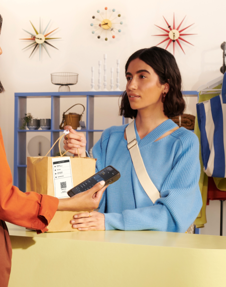
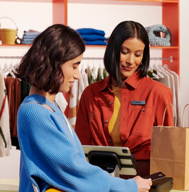
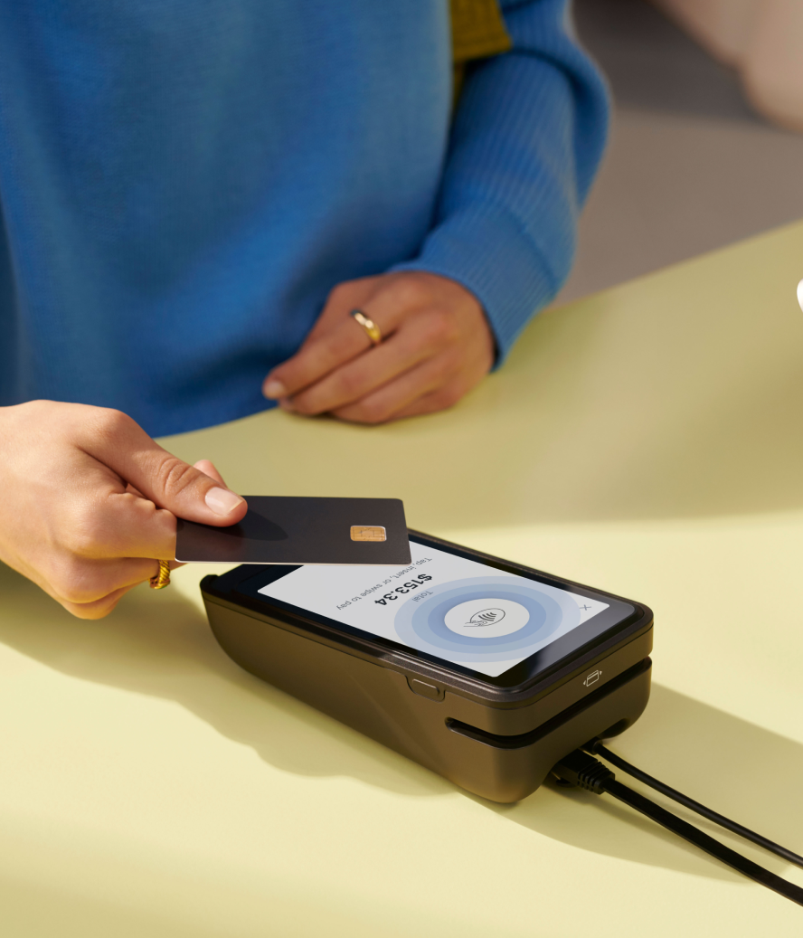
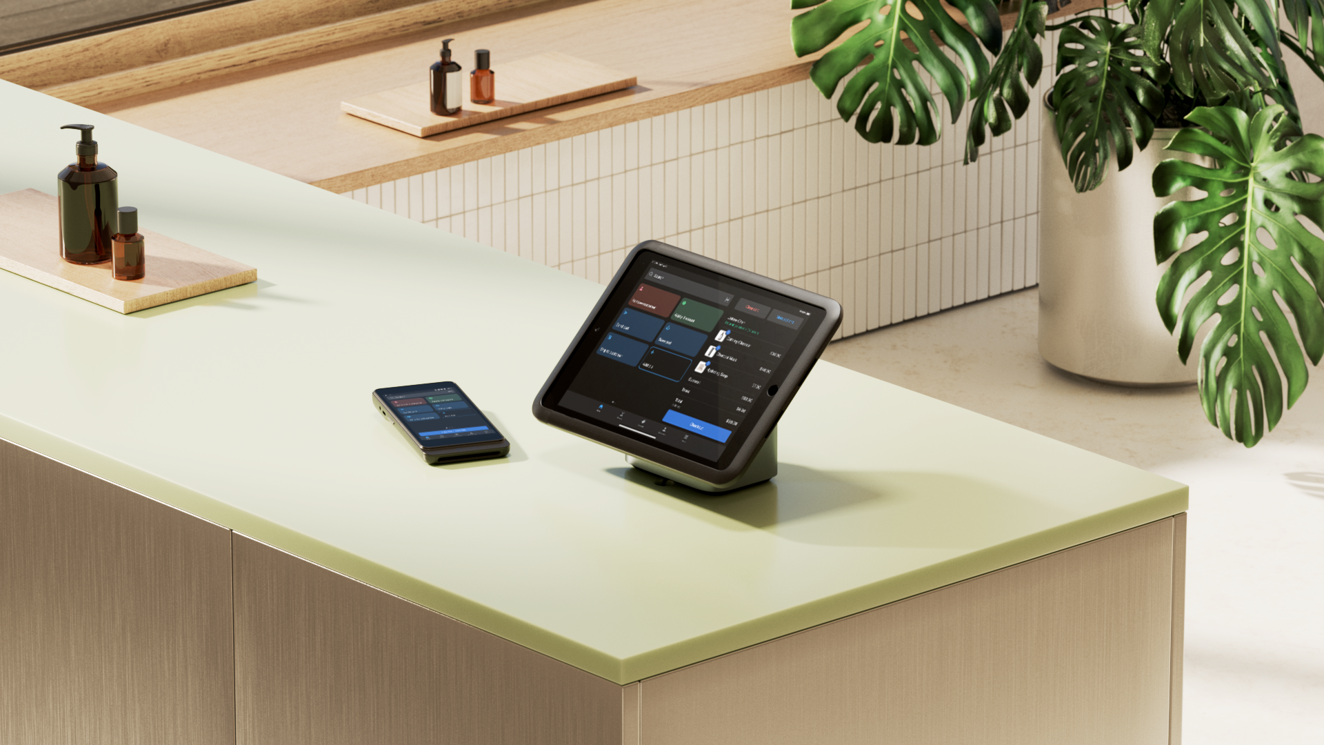
The checkout area is a difficult thing to work around when you’re designing with a small store. But Shopify’s POS solution means you don’t need a physical stand to process payments. Use POS Go or a mobile card reader to take payments from anywhere in-store—no dedicated checkout desk required.


