How efficient are you?
I’m not talking about the digital products you design, or the user flows you orchestrate—I’m referring to you personally, your day-to-day processes. How efficient is your morning routine? Your route to work? How efficiently do you cook dinner, or run errands?
Our everyday lives are packed with processes, and the more often we complete them, the more we begin to perform these tasks on autopilot. We rarely do things efficiently the first time, and because we’re creatures of habit, those inefficiencies, however small, become ingrained into our routines.
How do we iron out a process, optimize a series of tasks, or streamline a workflow, regardless of its scope or complexity? For starters, you could try one of the most valuable UX exercises out there, an indispensible weapon in a usability guru’s arsenal: process mapping.
You may also like: How to Build Usability Testing Into Everything You Do.
What is process mapping?
Like the slew of other usability testing techniques—surveys, interviews, focus groups, eyetracking—the goal of process mapping is to glean insight from how the user will actually be interfacing with the digital platform.
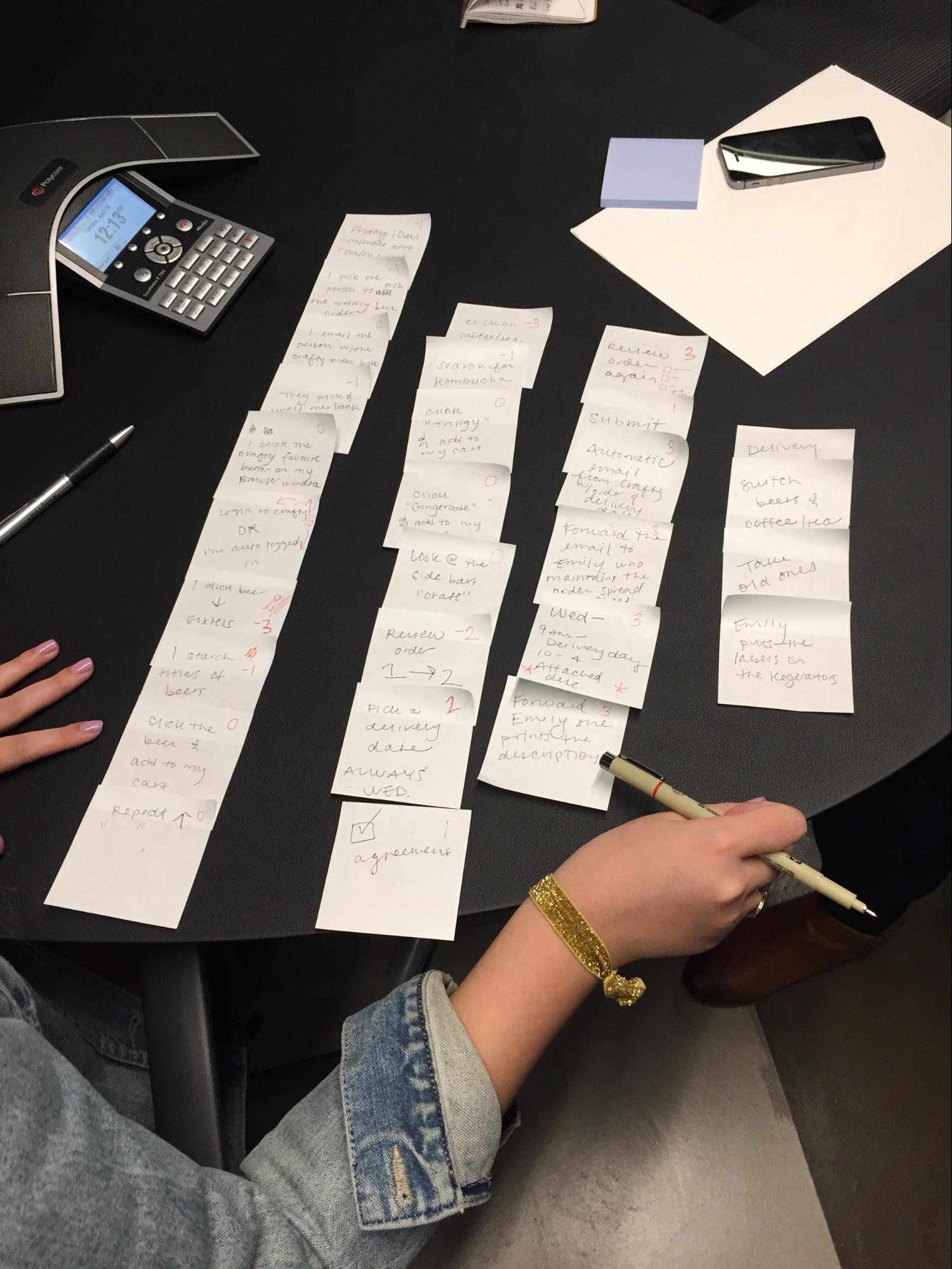
Process mapping, like a standard user interview, involves a one-on-one discussion between the user and UXer about the design problem at hand. However, unlike your typical interview, this one occurs while the user is completing a process, and forces them to write out each step of it.

By having a user write down each step as they’re completing it, the process becomes deconstructed into its smallest units, making for easier analysis (we’ll get to that in just a bit). In other words, if we complete tasks on autopilot, process mapping forces us to turn it off and carefully consider each step.
Let’s do a simple example. Here’s how I check my email:
- Open Google Chrome by clicking its icon on the Dock
- Type in ‘g’ into the URL bar, which Google Chrome autocompletes to ‘gmail.com’
- Press enter
Even when a task as simple as checking your email is deconstructed, we can immediately spot areas for improvement. I could set my inbox as the home page for my Internet browser, for instance. And while the simplicity of this example lends itself to easy analysis, more complex scenarios require deeper investigation. This brings us to second step of process mapping: the mapping itself.
The Complete Guide to Web Design Project Management
Read our complete guide to web design project management for developers, designers, and marketers. Learn how to work with stakeholders, manage budgets, and keep your clients happy.
Learn moreMapping tasks
Once every step has been written down, the user should rank these steps by the UXer’s choice of criteria, the most common being difficulty and necessity. In other words, how necessary was the step in completing the task, and how hard was it to complete that step?
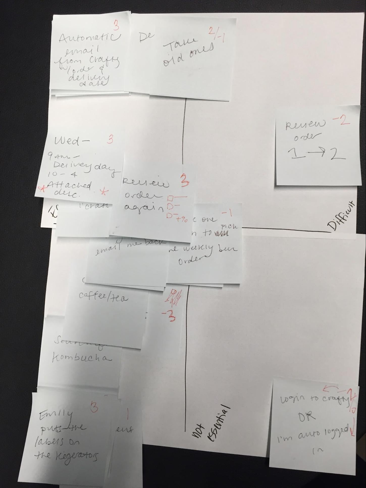
Because we’re asking users to rank by two variables at once—and because most designers prefer visual representations of data—we can use a basic XY plot, where each axis represents a variable. The result looks something like this:

In a single, easy-to-read visual, the designer has identified which steps are frustrating, which ones aren’t, and which ones shouldn’t be in the process at all. No lengthy interview, heat mapping, or eyetracking required. It’s a fast, simple collaboration between tester and subject.
Best of all, process mapping is ideal for usability testing in the ecommerce space , because so much of online retail can be easily divided into distinct processes. Account creation, adding items to a cart, checkout, returns—these are all fundamental operations for every online store, and process mapping is a quick way to ensure they’re in tip-top shape.
You may also like: Five Useful Usability Testing Tools Proven to Convince Clients.
How do I conduct a process mapping exercise?
Sold on the power of process mapping? Here’s a step-by-step guide to implement it into your usability testing.
Materials needed
- Usability tester
- Test subject
- Pen, pencil, or some other writing utensil (I’m a Sharpie man myself)
- Post-Its (and lots of ‘em!)
- Large paper pad or whiteboard (for mapping)
Establishing scope and criteria
Once you’ve gathered all the materials, it’s time to determine the size and scope of the processes you’ll be testing. The digital product’s use cases need to be broken down into digestible portions, just like if you were testing by module. Onboarding and checkout are common segments, but other processes might take a bit more deconstruction, depending on the nature of the experience you’re testing.
Now that we’ve identified the processes we’ll be testing, we need to nail down the criteria by which your user will be judging the process steps. As I’ve previously mentioned, essentiality and difficulty are the standard, but certainly aren’t the only variables to use. Depending on the experience you’re testing, you could ask how enjoyable each step was, how long it took to complete, or any other relevant criteria.
Armed with this testing plan, you’re ready to process map. First, ask the user to complete the assigned task, writing down each step that they take on a Post-It note along the way. It’s important that the user writes it, not the tester, and be sure to emphasize the importance of being granular. In other words, don’t let them just write “created an account’ as a step—it should be detailed.

Finally, ask the user to map out each step on an XY plot like the one above. Again, it is important the user do this freely, without any interference from the tester.
Analysis and questions to consider
Now that you’ve got your process map, the only thing left to do is analyze and draw actionable conclusions. The placement of steps on the process map should help you answer questions like:
- Where are the pain points in the experience?
- What steps are easiest, and may not need tweaking?
- Which steps are complicated, and need to be simplified?
- Are there any parts of the process that can be cut outright?
- Is the process as a whole usable?
Let’s do a quick example. Say a test user has just process mapped the onboarding of a clothing delivery subscription app (like Trunk Club). By asking a few of the questions above, we can see how easily the answers translate to actionable design decisions:
- Where are the pain points in the experience?
“Looking at the Difficulty axis XY plot, it looks like the hardest part of the process was entering payment information. The subscription tiers were confusing, and when I finally selected one I had to manually enter both my Billing and Shipping addresses.”
Immediately, we see the fixes: a simple radio button that the user can check to indicate the billing and shipping addresses are the same, and a rewrite of the copy describing the different subscription packages.
Let’s do another example, this one for a music streaming service.
- Are there any parts of the process that can be cut outright?
“It was easy to port my music library from apps like Apple Music and Spotify, but afterwards it asked me to identify what types of music I was interested in for playlists. If it already has my library, can’t it just use that?”
A valid point here: it makes sense to ask the user to describe their musical taste if they’re starting a library from scratch, but if there’s already data available on their preferences, a smarter app would be able to make recommendations based off their preexisting library.
These are just two quick examples of how process mapping helps the user provide much more valuable feedback. It not only leads to richer qualitative data, but also presents it in an easily digestible, visual format.
You may also like: Thinking about A/B Testing for Your Client? Read This First.
Get mapping
Life isn’t meant to be perfectly streamlined or ruthlessly efficient . But if you’re a UXer, the digital products you craft should strive to be. Process mapping is a simple, reliable way to identify opportunities to simplify your processes.
Read more
- Forget User Experience. Start Thinking About Client Experience.
- The Pivotal Role of User Experience Design in Brand Building
- Designing for the Next Billion Users
- 10 Ways to Improve User Engagement for Your App This Valentine's Day
- 22 Basic UX Laws That Every Designer Should Know
- Free Webinar] How to Convert Visitors Through Persuasive Design
- The Age of Nanodesign: How Mobile Commerce is Transforming UX and CX Forever
- The Use of Color Contrast in Mobile Ecommerce Design
Have you used the process mapping technique in your usability testing before? What criteria do you rank on? If you don’t use process mapping, what techniques do you like to employ to ensure your digital products remain efficient? Let us know in the comments below.


