 Visual design is the creation of a visual aesthetic.
A successful visual design does not take away from the content on a page. Instead it enhances content by engaging users and reducing bounce rate, and helps build trust and interest in the brand.
The visual design techniques mentioned in this article (duotones, hero images, video, and illustrations) are able to create a more interesting, immersive, and remarkable experience if done properly (learn how to properly plan these techniques in our articles on prototyping and rapid prototyping, or look at some great prototyping tools). They help designers grab a user’s attention and direct it towards the intended conversion goal. Not to mention, these techniques are also quite trendy.
For each technique, I’ll explain why they work and how you can use them in your own design projects. For more inspiration, check our our roundup of what makes a strong web design portfolio, or learn how to create an effective design brief to keep your project on track.
You might also like: 17 Web Design Trends To Watch in 2017
1. Duotones
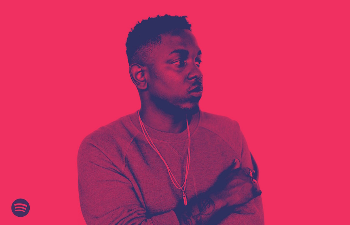
It’s hard to find a design technique that’s more fun to play with than color. Vibrant colors are the latest design trend, and the duotone effect is a particularly hot design technique.
The duotone technique comes from the printing presses; duotone prints are made in two shades of the same color, or with black and one tint. The technique that was once a print staple has found new life online.
Benefits
- Different hues can help distinguish content.
- Duotone is visually stimulating, especially useful for minimal sites.
- Duotones look great both on desktop and mobile screens.
Best practices
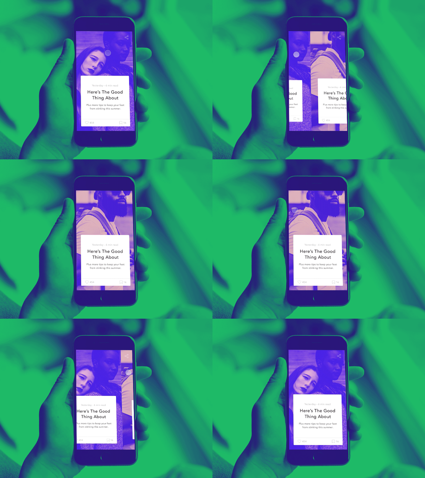
- Use duotone to create a dominant image. Select simple high-quality photos with a single, clear subject. Busy photographs with a lot of detail may be obscured.
- Pick colors that reflect the mood of the photo. Keep in mind, different colors evoke different emotions.
- Use duotone as an accent. While duotone effects lend themselves to large images, they can work in smaller places as well. Consider a duotone accent for secondary images, or for specific types of content.
How to create the duotone effect
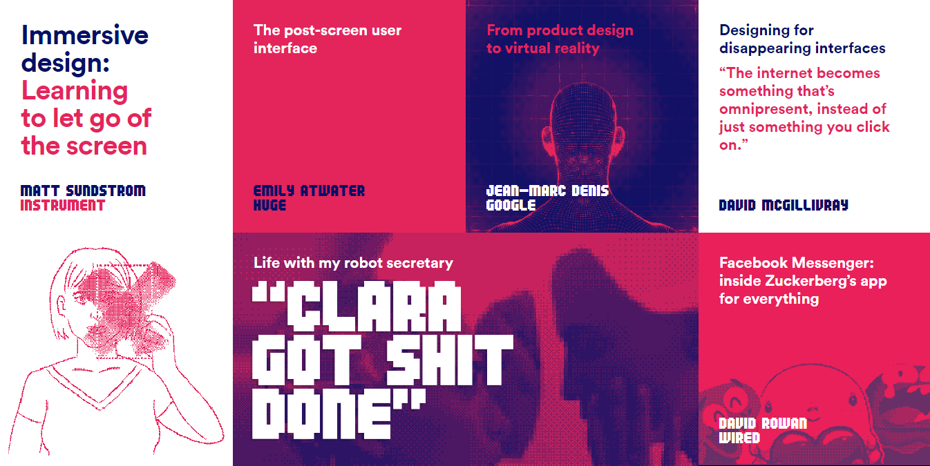
Duotone is fairly easy to create — all you need is the existing image in Adobe Photoshop and a two-color gradient.
If you design a website and want to create a duotone effect for your image, you can do it without any modifications to the existing image. Simply use Colofilter.css to apply the effect in CSS code.
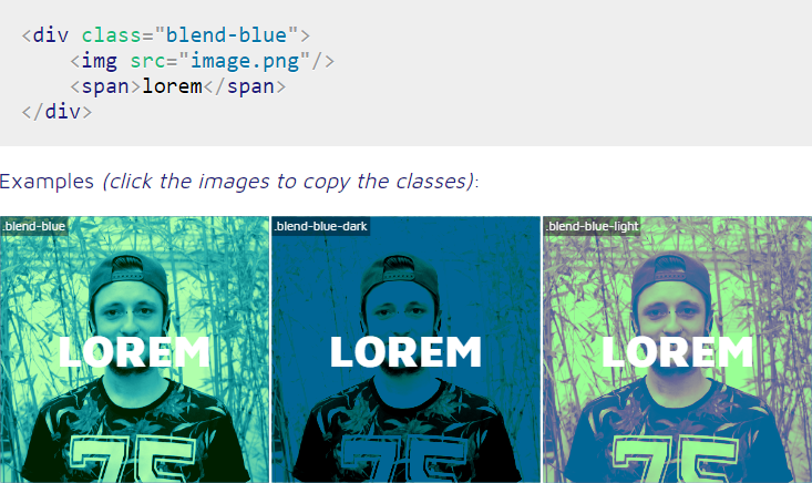
How to use duotone
A duotone color overlay can help flatten color variations in an image, so that text can be placed using a single color almost anywhere on the image, and still be readable.

Summary
Duotone can spice up an image and help engage users visually. This effect also works as an excellent underlying base that livens up the content, and at the same time gently spotlights the beauty of the picture. Last but not least, creating duotone is fun and the end-result almost always looks custom. What it will be — dramatic, impressive, or serene — depends on prefered colors and the creative imagination of the designer.
2. Hero images
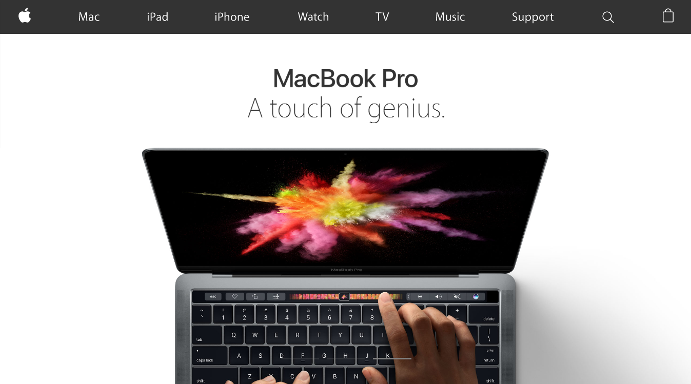
Full-width, above the scroll images are one of the most popular trends in website design. Generally speaking, these large feature-style images are photographs which directly relate to the site’s content. But hero images are more than mere decoration, they are a powerful tool that can help you communicate and differentiate your product.
Benefits
- Help engage the user — large images draw the user in immediately.
- Create space between the content. Hero images makes the page less cluttered.
- Fit into responsive design frameworks.
Best practices
- String together with a theme. Connect your hero image with similarities, such as a single color or type of animation.

- Consider asymmetry. Asymmetry works well as long as it’s visually balanced. You can create asymmetry by shifting either text or visuals to a certain side of the page. Asymmetry also helps you create a visual flow that matches the user’s scanning patterns.
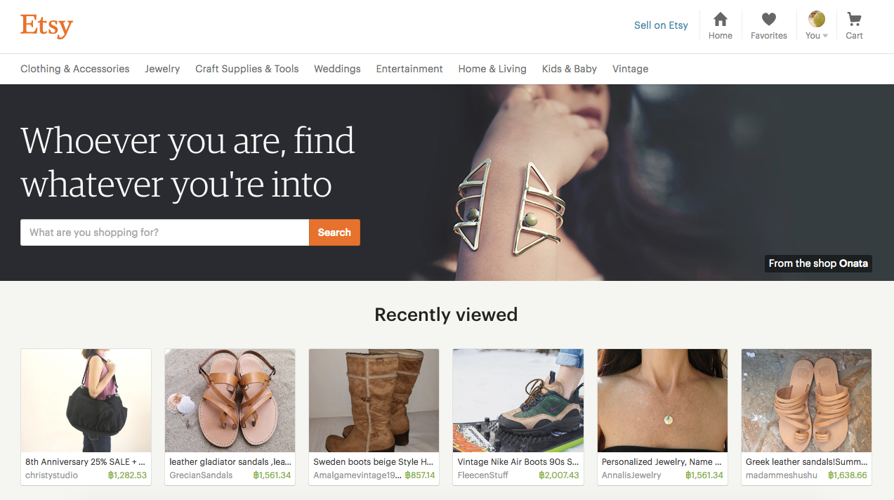
- Provide high-resolution versions of images. Nothing is worse than a large, low quality image. If you’re going to use this technique, the image is everything and must be clear and crisp.

Things to remember
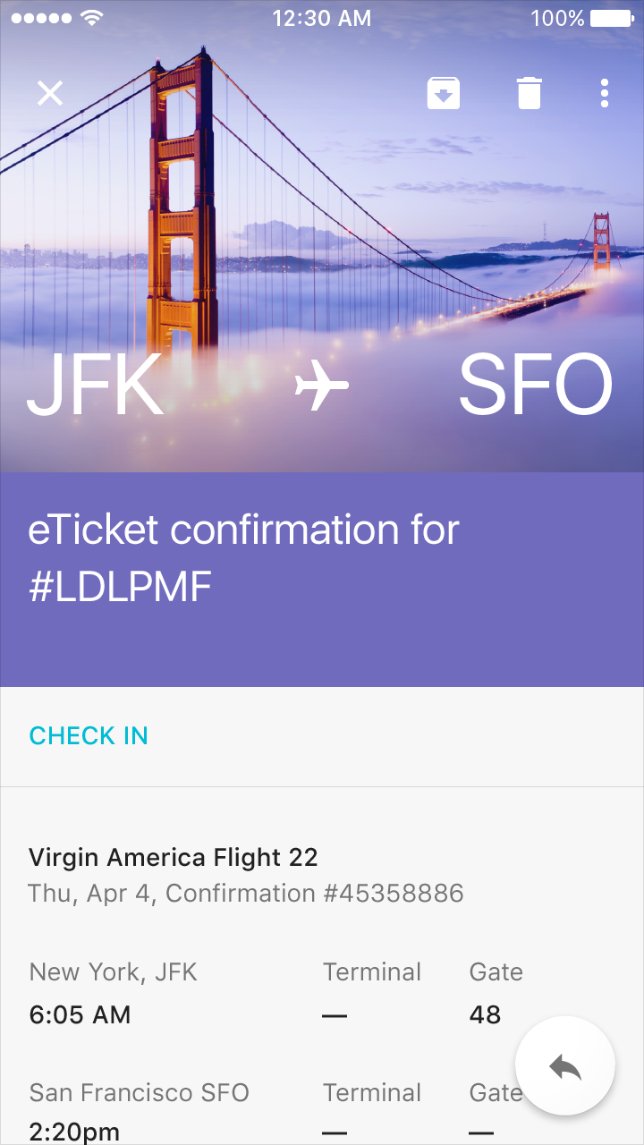
Images can make or break UX. Choose the wrong image, and visitors will immediately leave your site or close your app. Pick the right one, and they’ll stick around to see more of what you have to offer. Thus, ensure images have a strong relationship with your brand/product goals and provide context about the content.
How to adjust images for devices of different sizes
Responsive websites and mobile apps often struggle with selecting image resolutions that best match the various user devices. It’s quite clear that one image for all screen resolutions and different devices is not enough.
However, an image per pixel is too much — cropping images one at a time can be overwhelming, especially if you have a ton of images.
So how can someone automatically choose the optimal responsive image sizes? Luckily, there are online tools that allow you to manage multiple sizes for an entire folder of images. One of them is Cloudinary which enables you to interactively generate responsive image breakpoints.

How to use
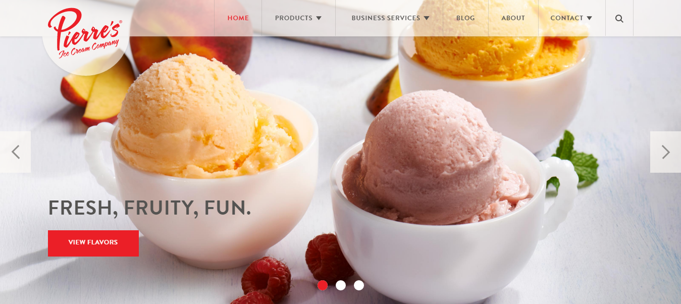
Hero headers are the perfect container for a bit of information. As long as your image is high quality, interesting to look at, and works well with your content, a hero-style homepage design is a great option.
Summary
Large images are visually appealing. They can be a powerful way to capture a user’s attention and communicate your message.
3. Video
Designing an app or website doesn't mean you have to create a static experience — it's not print. With increased internet speeds, videos are becoming more popular.
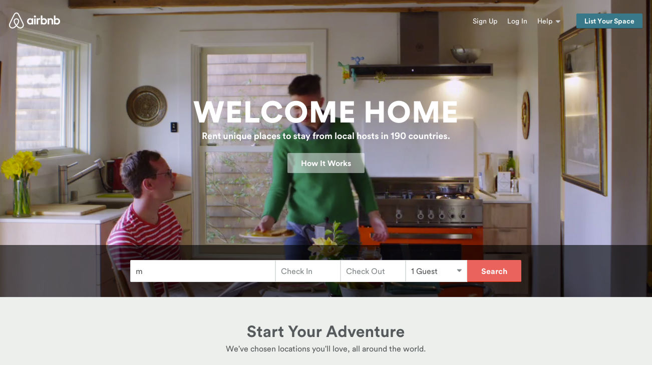
Video also works in much the same way as images when it comes to the hero-style design; they draws users in from the start, making them great homepage backgrounds.
Benefits
- Can be used together with other content — such as text and images. Various media formats can supplement and reinforce each other.
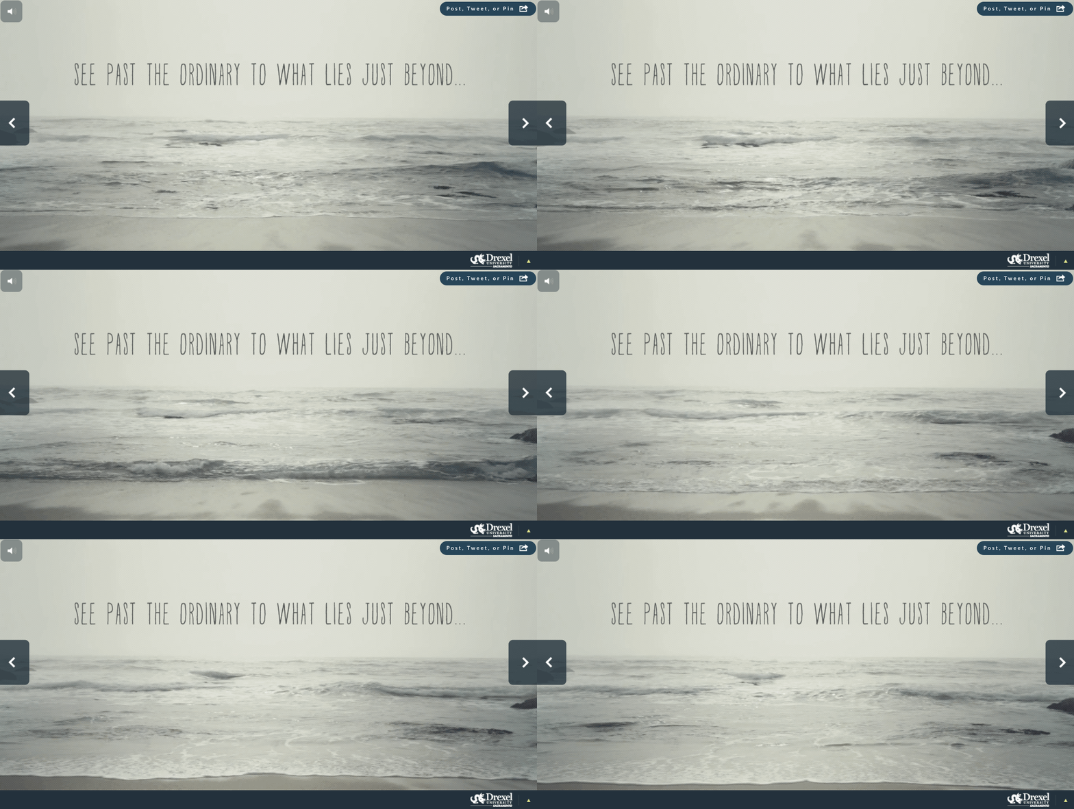
- Video is designed to captivate the user emotionally. It can bring a sensual feel of a time and place that photography can’t provide.
Best practices
- Don’t rely solely on video. There is no standard behavior for users when they encounter video on a website or in an app. As such, there is no guarantee that someone will watch video content when it is presented.
- Demonstrate the value in the first few seconds. The beginning of the video is the most important part as attention spans can waiver quickly. Users need to be able to quickly understand what they are watching, and see its value.
- Watch your bandwidth.Video is expensive, it costs a lot of megabytes and should be used with extreme caution. Consider using video loops 10 to 30 seconds long — a good balance between engaging content and manageable loading times.
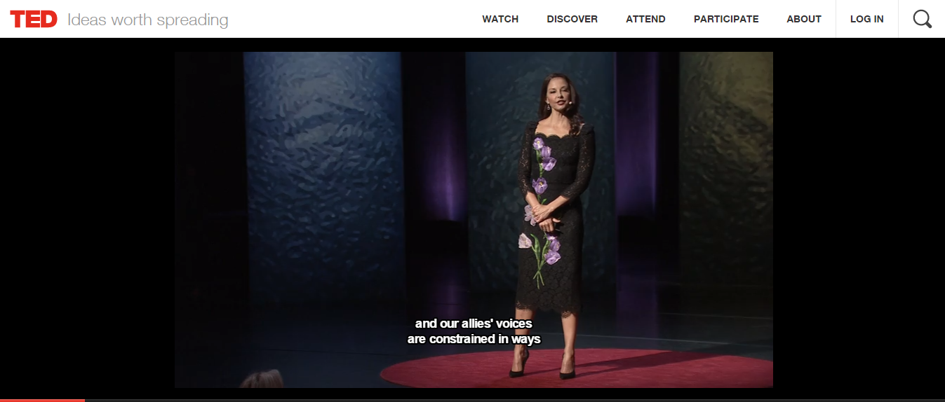
- Give users control. Video content is helpful only if users can manage their experience. For any video or audio content, users should easily be able to start, stop, or restart it, as well as mute or adjust the volume.
- Sound should be turned off by default. Since users are not expecting sound, set the default to ‘off,’ with the option to turn it on themselves.
- Accessibility is important. From an accessibility perspective, providing content as a video can limit access to the information contained in this format for anyone who cannot see or hear it. For accessibility, captions and a full transcript of the video should be included.
How To Use
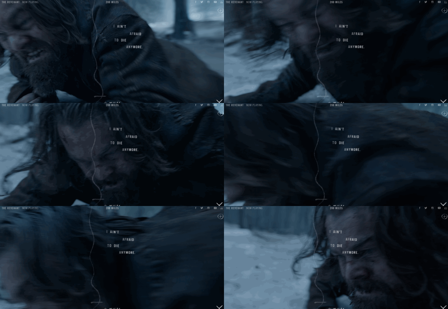
The promotional website for Oscar-winning film The Revenant, makes full use of the full browser-sized background to generate the mood. It also provides context to the film’s story: the music and the scenes in the video work together perfectly to set the atmosphere.
Summary
When used effectively, video is one of the powerful tools available for engaging an audience — it transports more emotion and allow people to “feel” a product or service.
You might also like: How to Use Video in Ecommerce Web Design to Boost Conversions
4. Illustrations
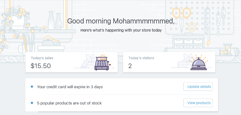
Illustration is a communication tool that can add clarity to a complex idea. They are fantastic, versatile mediums for creating visuals that are playful and friendly. Harmoniously used together with other elements of the layout, illustrations not only help guide the user along their journey but also make the entire experience more enjoyable.
Benefits
- Illustrations have more personality than photos. They appeal to a user’s imagination to establish a stronger personal connection.
- Illustrations can be mapped out to connect to the core business values or principles.
Best Practices
- Animations and illustrations have always gone hand-and-hand. Animations make illustrations more fun, and the motion attracts attention.
- Tailor illustration to match the tone of the brand. The illustrations should feel consistent, like they came from the same source — the same company, the same brand, the same voice, and the same person.
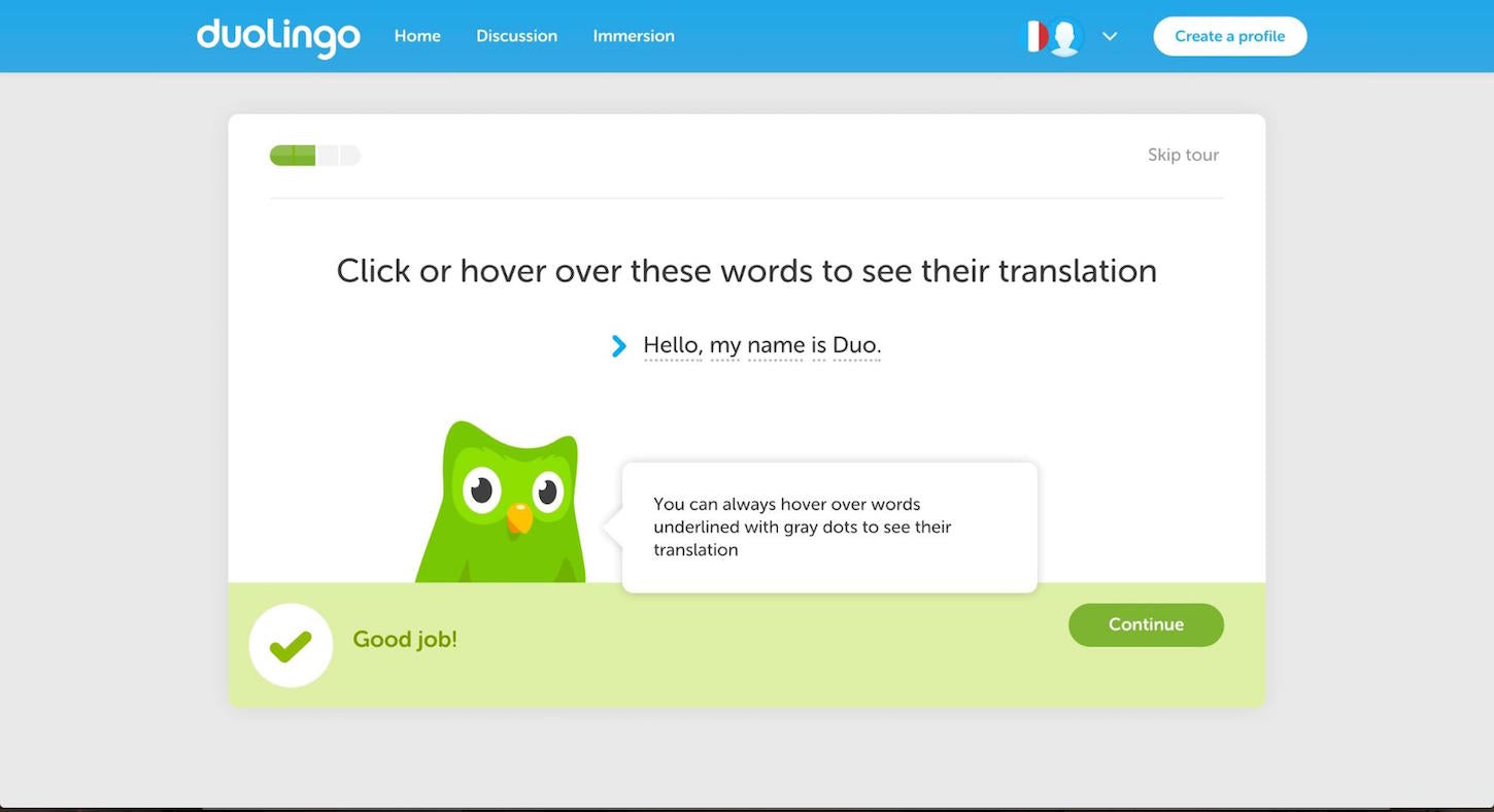
- Use illustrations for instruction and tutorials. Even apps and websites that don’t incorporate the drawn style can still use cartoons for instruction and tutorials.
How to use
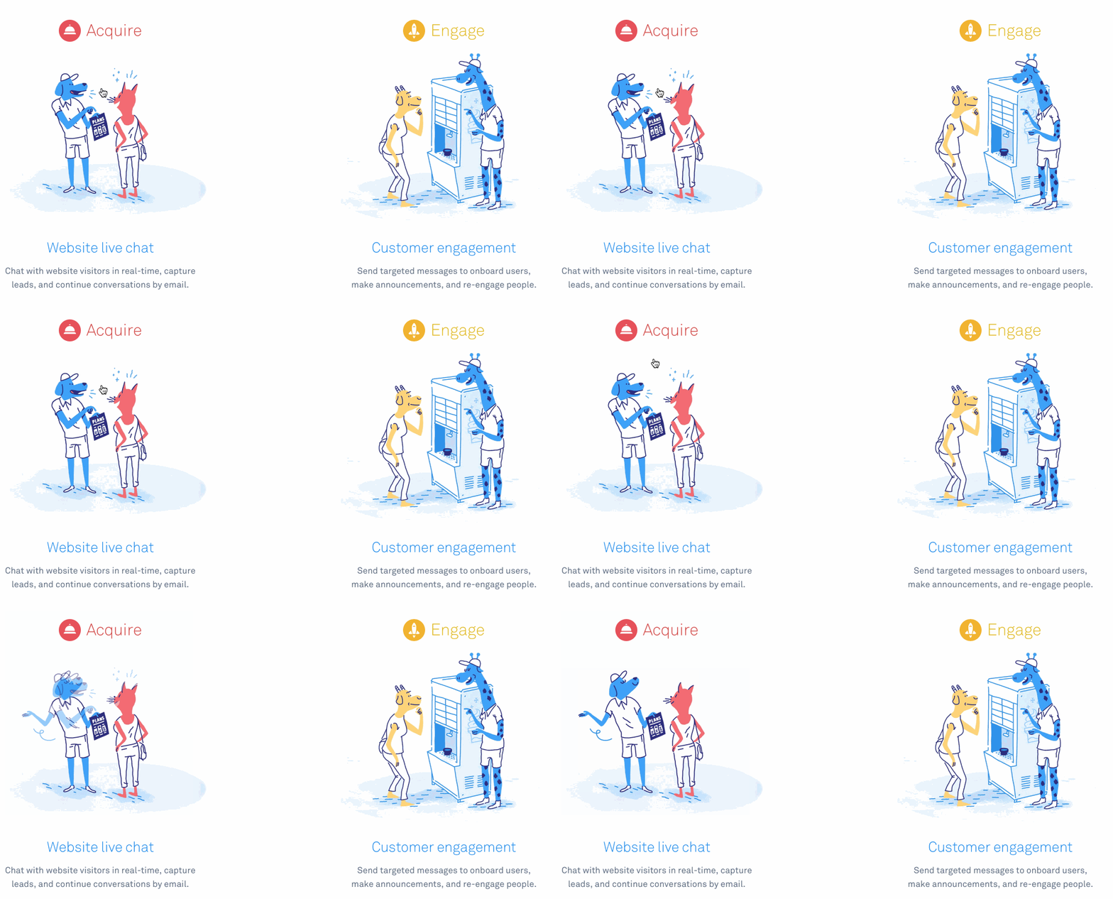
The landing page of Intercom takes a reasonably complex idea of communicating with customers, and makes it easy to understand how the product works, and why it might be beneficial.
Summary
Illustration is a powerful tool in designer’s toolbox. They catch a user’s attention, become the memorable element, and create important support for a stylistic concept. Using illustrations it’s possible to make interface both attractive and efficient.
Your Building Blocks
Visual design techniques are the building blocks of today’s design, and you’ve now learned the techniques behind some of the most popular design trends.
In closing, remember to always apply trends in context. Not every technique will work in every situation, or for every application. Thus, only implement them if they make sense in your particular context and benefit your users.
What trendy visual design techniques are you using in your projects? Let us know in the comments section below!
Read more
- Shopify's Web Design and Development Blog in Review: The Top 10 Articles of 2017
- How to Improve Your Client's Loyalty Program with Gamification
- 8 Conferences to Save Your New Year's Resolution
- Going Deep on a Great Night’s Sleep
- 6 Places to Find Design Inspiration Early in Your Process
- Conquering Our Caffeine Addiction: 8 Surprising Substitutes for Coffee
- Mike Kus Talks Design Process
- 10 Podcasts to Help You Get Creative
- Tips for Offering Product Unboxing Consultation Services to Your Clients
You might also like: 12 Beautiful Portfolio Websites to Inspire Your Own Design

