Mobile is quickly taking over the world. According to comScore, nearly 70 percent of digital media time is spent on mobile devices. This means that trends happening on mobile are especially important to pay attention to, since what starts on mobile can influence other areas of digital design , or even transform the environment around us.
As with trends of any nature, some come and go, and others stay and become fundamentals. In this article, I want to review 10 fundamental mobile trends that are shaping mobile design in 2018.
Learn how to craft an effective project brief to keep your designs on track.
1. Time-saving design
This is by far the most important trend in mobile design. When people pick up a phone, they want to get something done. The time it takes to complete a task is often used as a measure of an app’s success. Users want to use products that help them reach their goal as fast as possible.
The following techniques help designers minimize the effort required by a user to achieve their goal.
Linear user journey
A linear user journey is a journey where users interact with content in a fixed order along a linear path. Usually, users are allowed to do just one specific action at each step of the journey.
The most significant benefit of a well-designed linear user flow is predictability. When a flow is presented as a number of steps logically connected to each other, users can predict what will happen next. This not only helps reduce anxiety, but also allows users to estimate how much time is required to complete a task and reduces bounce rate.
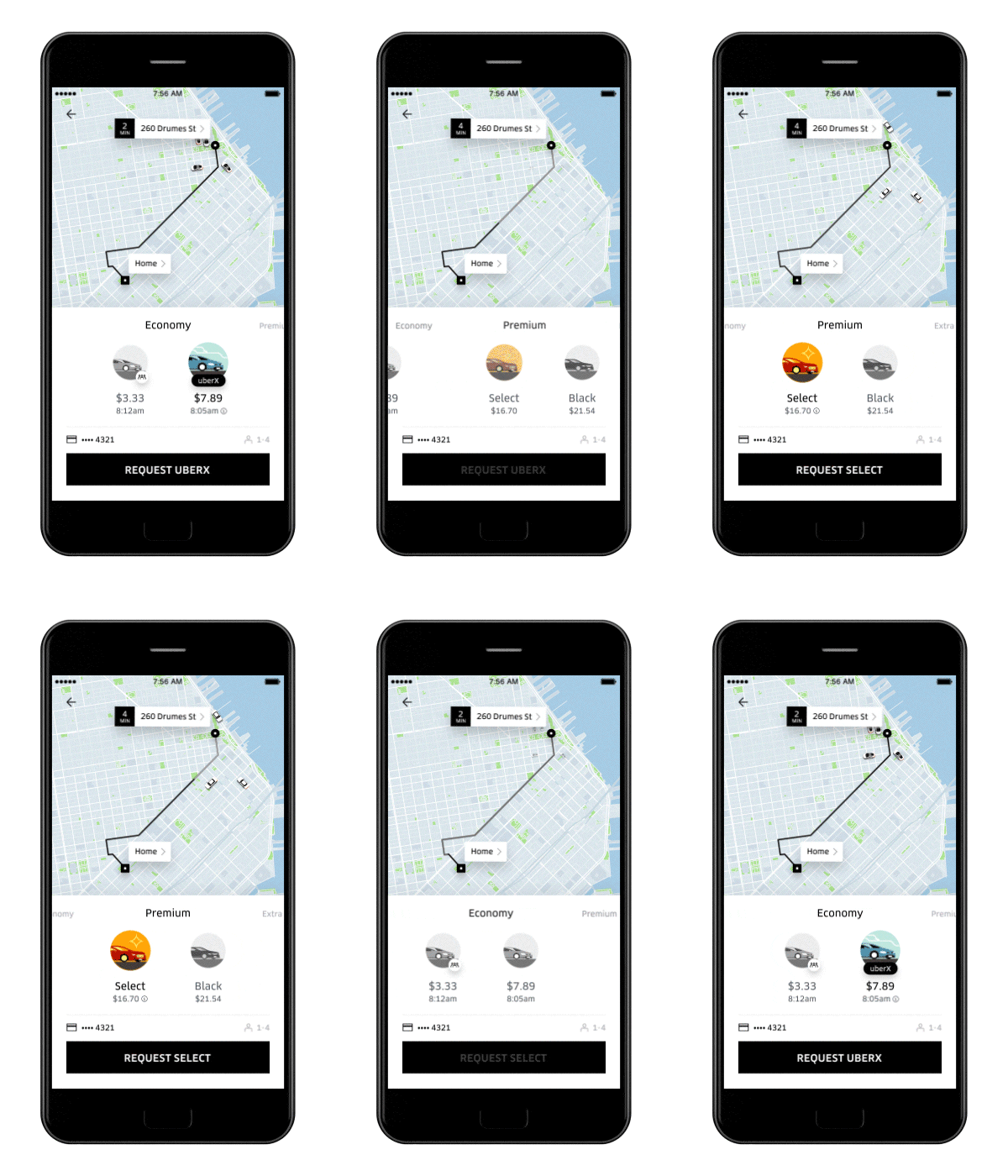
User journey simplification
It can be really annoying when a mobile app makes you take a lot of unnecessary steps before you finally complete a task. Mobile design is all about speed and simplicity, so it’s not only important to give users a step-by-step process to follow, but also to minimize the number of steps required to achieve a goal. Designers should strive to create an experience that doesn’t require too many interactions.
Neutral interfaces and content-focused experiences
Many designers try to reduce an app’s complexity by making their interface almost invisible. A popular trend known as Zero UI (or ‘Complexion Reduction’, as Michael Horton calls it) is focused on stripping away all decorative elements and concentrating all of the user’s attention on the content. Content-first layouts allow users to consume the content without any distractions.
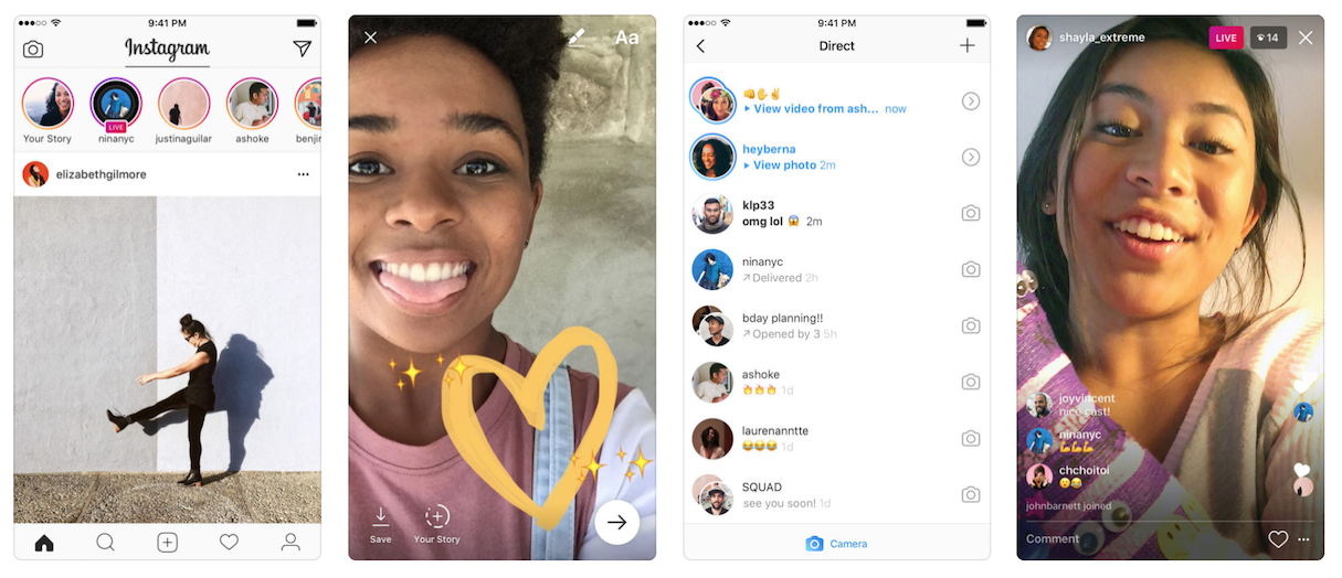
Progressive disclosure
Modern mobile apps and websites have become really complex products that provide a lot of information and features. Offering all of this amount of information at once can easily overwhelm and confuse users.
To overcome this problem, designers use a technique of progressive disclosure. This technique solves the problem of complexity by making information or features available only when users need them. Progressive disclosure can help reduce cognitive load and improve comprehension of the interface.
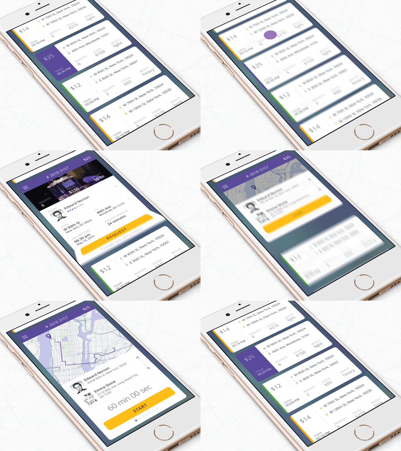
Guidance and assistance
More and more designers are focused on designing for failure—they proactively look for steps in the user journey where users might need help, and build in assistance for users at such moments. In the most basic form, this could be content-specific information on how to overcome the problem.
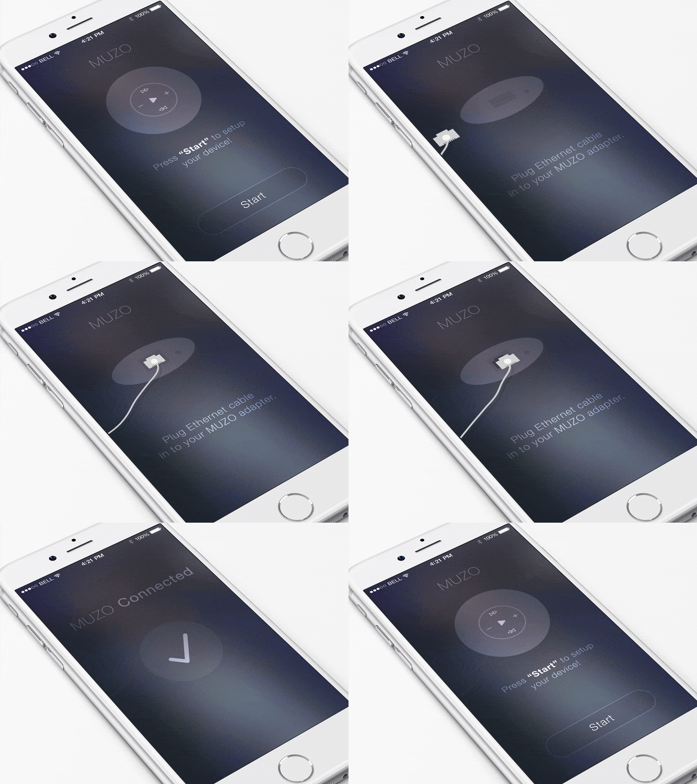
Location awareness
Product designers can also use a device’s location data to simplify certain operations. For example, if you’re designing an app for food delivery, instead of asking the user to provide their address, you can auto-detect their current location and ask the user to confirm that that is where they want to receive their delivery.
Anticipatory design
Decision fatigue is a real problem in today’s world. We have thousands of choices to make throughout the day, and this impacts our ability to make effective decisions as the day goes on.
Because of this, mobile app design should try to limit the number of decisions a user must make while interacting with it. Apps that ask us to make many decisions can cause friction, and users might consider replacing the app with an alternative..
In an attempt to improve user experience, many product designers try to follow an approach of anticipatory design—that is, they try to anticipate a user’s needs before the user needs to make any decisions.
One good example of anticipatory design is Spotify’s Discover Weekly feature. This playlist is created automatically based on personal music preferences, meaning that users don’t need to spend extra time on searching the music they might like—the app does it for them.

Device’s capabilities
Mobile devices have a lot of built-in sensors, such as the camera, location tracking, accelerometer, and a touch sensor. These technologies can all be leveraged to improve user experience.
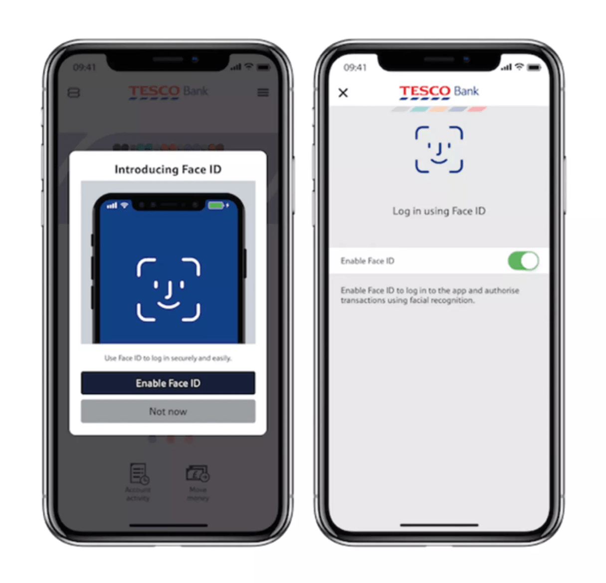
Biometric authentication is an excellent example of how a device’s capabilities can minimize the number of steps required to log in to an app. Designers can use biometric-based technology such as a fingerprint touch or facial identification to bypass the need for a traditional password.
This makes it faster and easier for users to interact with a mobile app—and research proves that users much prefer biometric sign-ins. According to Apple, the average iPhone user unlocks their device 80 times per day, and 89 percent use the Touch ID for this operation.
Color as a functional element
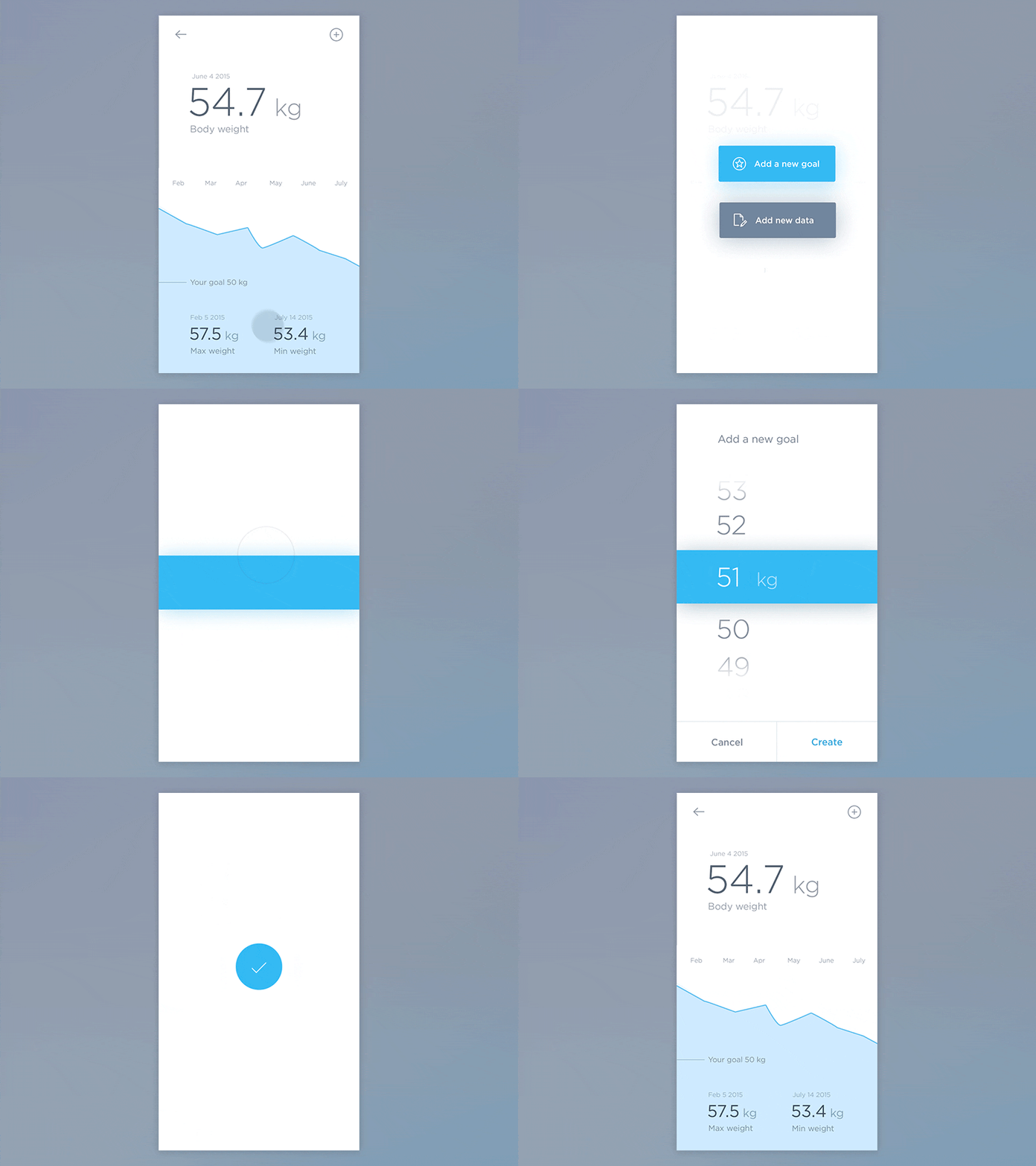
Without any doubt, color is one of the most powerful tools in a designer’s toolkit. But in modern mobile apps, color can be used for much more than purely aesthetic purposes—it can also become part of the functional experience. For example, color can help designers draw attention to specific parts of UI, or influence a user’s actions.
Сross-channel experience
Using a mobile app isn’t an isolated experience anymore. Many apps span platforms, devices, and channels, and designers today should focus on the user experience as a whole across them all. The ultimate goal is to create a seamless experience across all iterations of the product. Users should be able to switch to a different medium and continue the journey.
According to Appticles, 37 percent of online shoppers do research on mobile but switch to desktop to complete a purchase. Thus, if you’re designing an ecommerce app, synchronization of user progress across devices should be a key priority.
If you're keen to craft seamless experiences checkout our tutorial on mobile logos.
You might also like: 5 of the Best Prototyping Tools to Test Out Your Web and Mobile Designs.
2. Brand differentiation
Earlier, we talked about neutral interfaces, where content takes the center stage and the interface is downplayed. And while these neutral interfaces bring a lot of benefit to users, they also bring a few challenges for designers. One of the significant issues of neutral interfaces is that all such interfaces look similar. As a result, it becomes harder for designers to create a truly memorable and unique experience.
Brand differentiation is an essential property of design. It's crucial for brands to be able to distinguish themselves. Here are a few tools designers use to stand out in a crowd and make an app noticeable on the market.
Bespoke illustrations
Bespoke illustrations have quickly become a valuable part of the mobile experience—they not only serve a functional purpose by communicating complicated concepts in glance, but they also delight users. In the article Building a New Illustration Style for Shopify, Meg Robichaud shares a few practical tips on how to design illustrations for digital products.

Typography
While the primary purpose of typography is to deliver content, typography can also be used for creating an identity. Typography can give a tone to the voice of your interface—and designers can play with font size, weight, and other properties to make a message stand out and an app memorable.

Animation
Motion and animation plays a key role in mobile design. Animation can be used in many different forms, starting from animated feedback on user interaction to delightful rewards that users receive when they achieve a goal. Browsing an interface full of well-crafted animations is like reading a great story —a truly memorable experience.

3. The rise of gestures
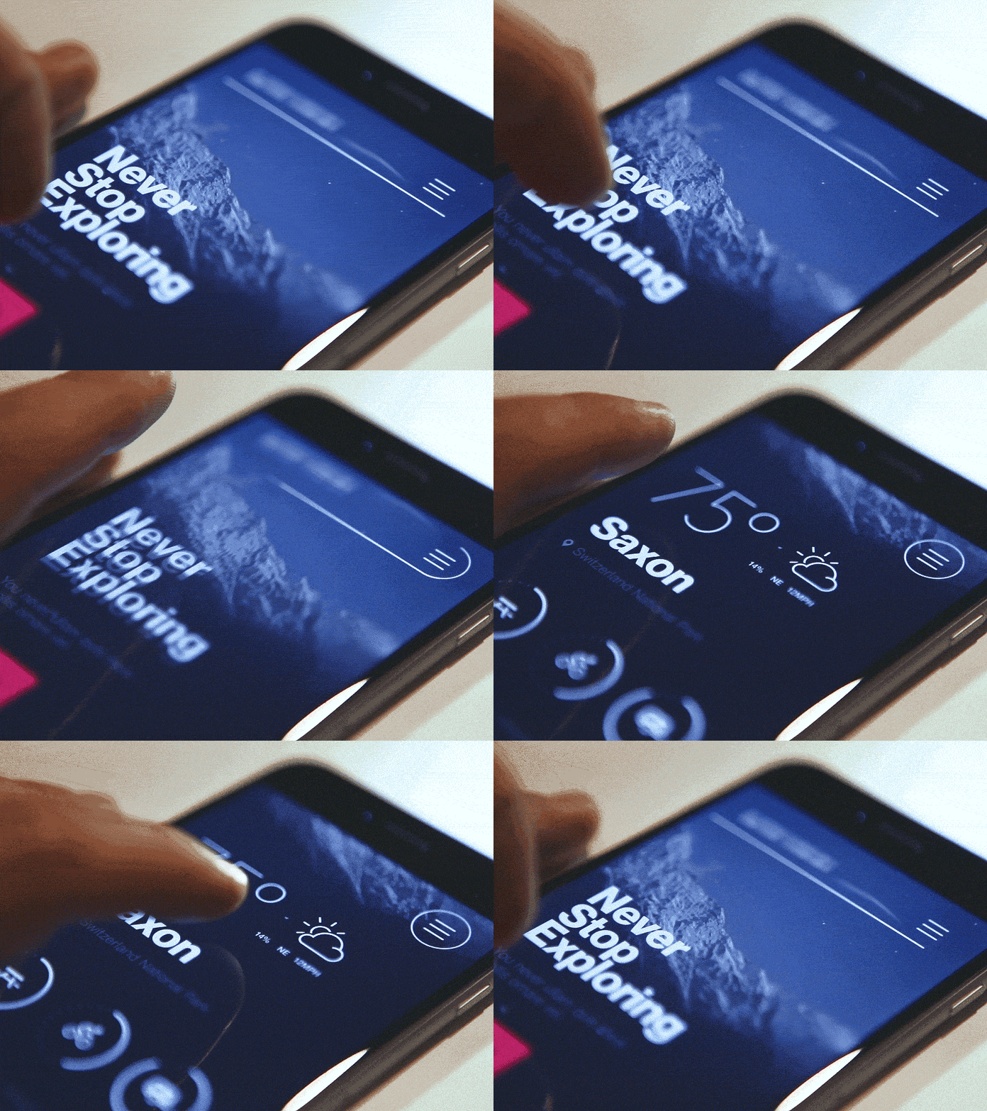
The release of the iPhone X introduced an exciting shift in a way we think about interactions with a mobile device. The lack of a physical Home button on the iPhone X means that even the most basic interactions with this device are gesture-based.
During the recent Google I/O, Google introduced new navigation in Android P. They rethought a basic way you navigate the OS, and now the navigation is based on gestures.
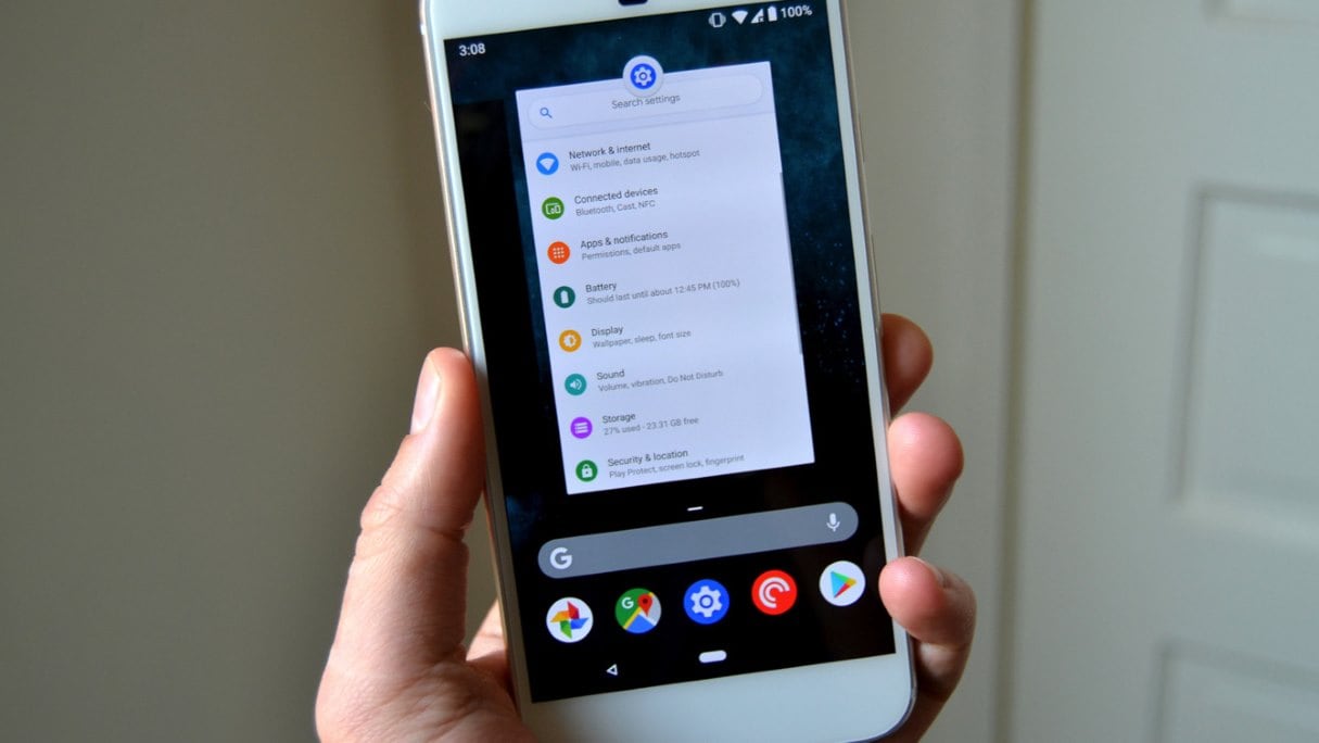
What does this mean for designers? It means that users are ready to adopt gesture-based interfaces, and that gestures should be a valuable part of mobile design. Buttonless UIs are an essential step towards interfaces that will rely entirely on voice and gestures.
Solving discoverability and learnability issues
Gestures bring a lot of advantages, such as saving valuable screen real estate, but they also come with challenges. Since gestures are hidden controls, creating a gesture-driven interface with good usability isn’t a simple task. In the article Gestural Interfaces: A Step Backwards In Usability, Don Norman discusses some of the severe problems of gesture-based interfaces, including discoverability and learnability issues.
To overcome these problems, designers can use animated hints. Such hints help users understand what actions are available and how to navigate the app.

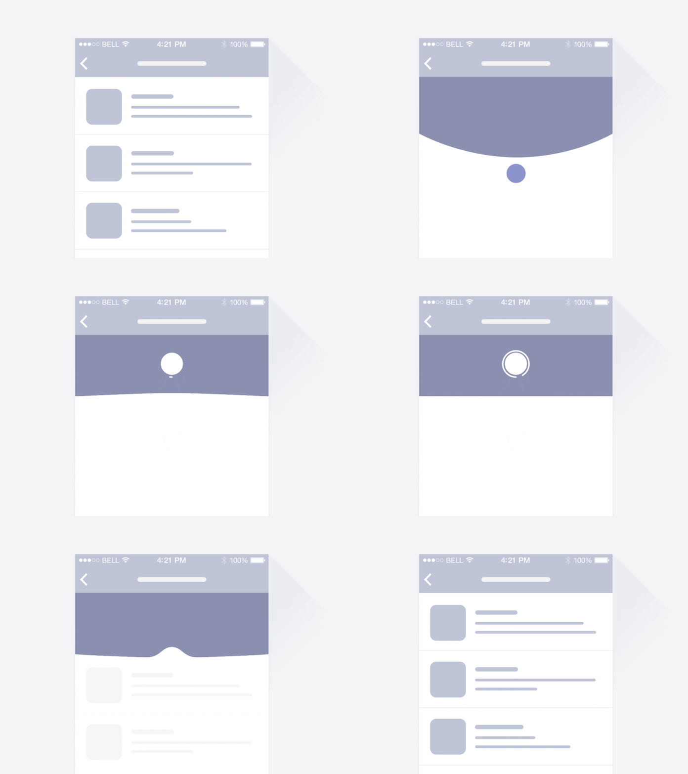
To overcome the problem of learnability, designers use standard gestures—gestures that are likely already known by the user. People are familiar with the standard gestures, so no extra effort is required to discover or remember them. For example, for feed-like apps with dynamically updated content, most users will expect to have a pull-to-refresh gesture which allows them to update content.
4. Emotional experience
When we talk about user experience, we usually mean creating a connection between the human and the machine. This connection is able to trigger emotions, and we’re seeing more and more emotional intelligence (EI) integrated into the mobile experience. EI is a powerful way to make the experience more engaging and delightful.
New ways of expressing emotions
Expressing emotions is natural. Even in the era of command line interfaces, we used emoticons to share our feelings with other people. With our mobile devices, we have an opportunity to share an even broader spectrum of emotion.
One example of this is Animoji — an animated emoji that responds to facial expressions via the iPhone X camera. It allows the user to create personalized, relevant reactions to share with their friends.

Mimic human emotions in UI
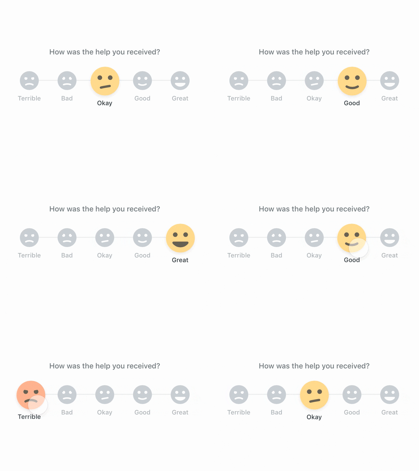
The trend of humanizing digital experiences is directly related to user emotions. As humans, we often treat interactions with our mobile devices as a social experience. We expect to interact with digital products the way we normally interact with each other, and designers should design digital products to meet those expectations.
Gamification
Gamification is not just about games—instead, it’s about incorporating game mechanics into the non-game environment. Gamification can make the process of interacting with an app exciting and catchy. Designers use challenges, leaderboards, and awards to motivate users who interact with a product.

5. Dominance of video
Video is quickly becoming a standard method of content consumption for many users. According to Insivia, 55 percent of people watch videos online every day, —and a large percentage of those views come from mobile devices. According to YouTube, mobile video consumption grows by 100 percent every year. By 2020, over 75 percent of global mobile data traffic will be video content.
Adapting video for portrait orientation
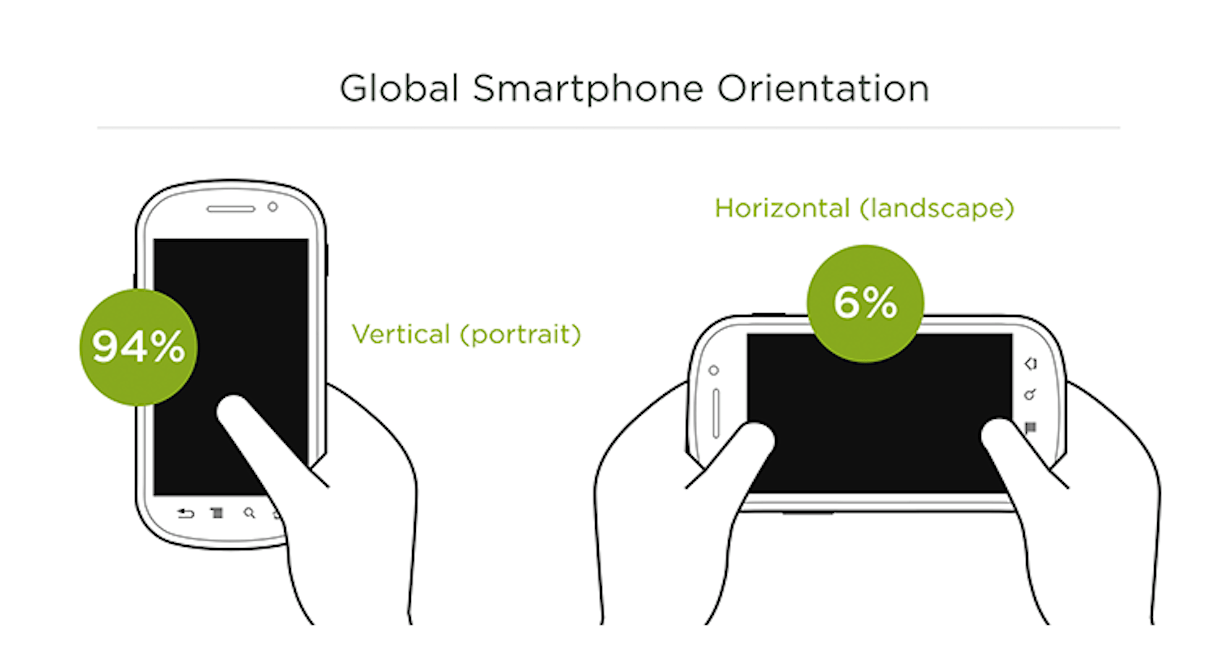
According to ScientiaMobile, 94 percent of users use their mobile device in portrait mode. If your app provides video content, it should be optimized to allow users to watch it in portrait mode.
6. Voice interactions
Graphical user interfaces aren’t the only way people interact with their mobile apps today. In 2018, we continue to move away from designing for taps and towards voice user interfaces (VUIs).
According to Gartner, 30 percent of our interactions with technology this year will happen through conversations with voice-based systems. VUI interactions are the definition of intuitive computing because users no longer have to learn a new language to interact with a system—they can just talk. As the technology matures, anyone that can speak will be able to operate a computer.
Learning a new skill set
Since mobile design is no longer solely about screens, designers should also learn a non-visual skill set. Understanding how to build great voice-powered interfaces will become a mandatory requirement for the UX designer of tomorrow.
Designers will need to focus more on the psychological aspects of interactions. Voice-enabled interactions require a better understanding of humans—not only the topics they talk about but how they talk about them. Humans communicate a lot through their tone when speaking, so the tone a system uses when asking a question or giving a reply will also have to be considered by the designer.
7. Smarter personalization
Just a few years ago, all it took to have a positive user experience with an app was to build an app that was usable and actually worked. Today, users expect much more from mobile experience—in fact, now everyone expects a personalized user experience. We’re moving quickly away from one-size-fits-all experiences and towards experiences tailored to individual users. Personalization can be a competitive advantage.
Content based on a user’s location
Also known as location awareness, this technique is about providing content based on where users are at that moment. Designers continuously try to find new ways of using this technology to create more benefits to users.
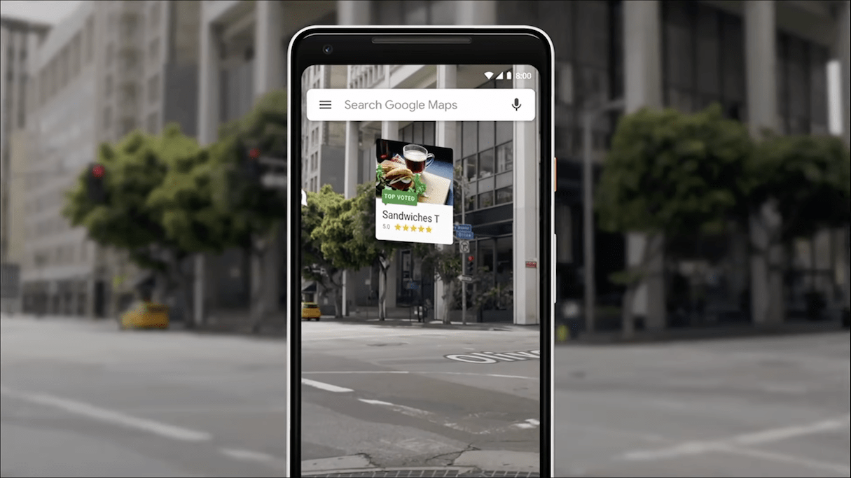
During I/O 2018, Google demonstrated a new level of the Google Maps experience. By pairing information about user’s location together with data from their device’s camera, the app can now provide additional information about an area.
Valuable push notifications
For a long time, push notifications were a great marketing tool. But recently in mobile app design, push notifications have become less about promotions and more about personal services. Services collect data and send notifications that are tailored to the needs and wants of individual users. As a result, users have better service delivery.

Rapidly adaptable apps
Rapidly adaptable apps are apps that can change dynamically to meet user needs. One good example of such an app is one that provides contextual onboarding—that is, it delivers different onboarding experiences based on real-time user progress in the app. By serving different content to different people, it’s possible to create a really flexible experience.
Machine learning becomes accessible
Most of the features that we consider a personalized experience are based on machine learning. For a long time, incorporating machine learning in app experiences was really expensive from a development point of few. But the situation might be changed soon.
Developers now have ML Kit, a set of APIs that allow them to work with image labeling, text recognition, face detection, smart reply, barcode scanning, landmark detection, and many other features. The great news is ML kit is cross-platform. It runs both on Android and iOS devices.
8. Offline-first experiences
When we design products, we usually assume that our users will be using our product while they’re online. But in reality, this might be far from the truth. To improve user experience, it’s worth considering that not all users will be online when engaging with your app, and making your app usable even when users are offline.
Another strong reason why designers should focus on creating great offline experiences is emerging markets. According to Google, a billion new users are expected to come online in the next couple of years. The vast majority of them will be from emerging markets (or so-called mobile-first countries, like India, Indonesia, Brazil, and Nigeria). The users in such markets have very different experiences and expectations than those who are in the US and Europe. If you want your app to be successful in such markets, it should be designed to be offline-first (meaning it’s usable even when it isn’t connected to the Internet).
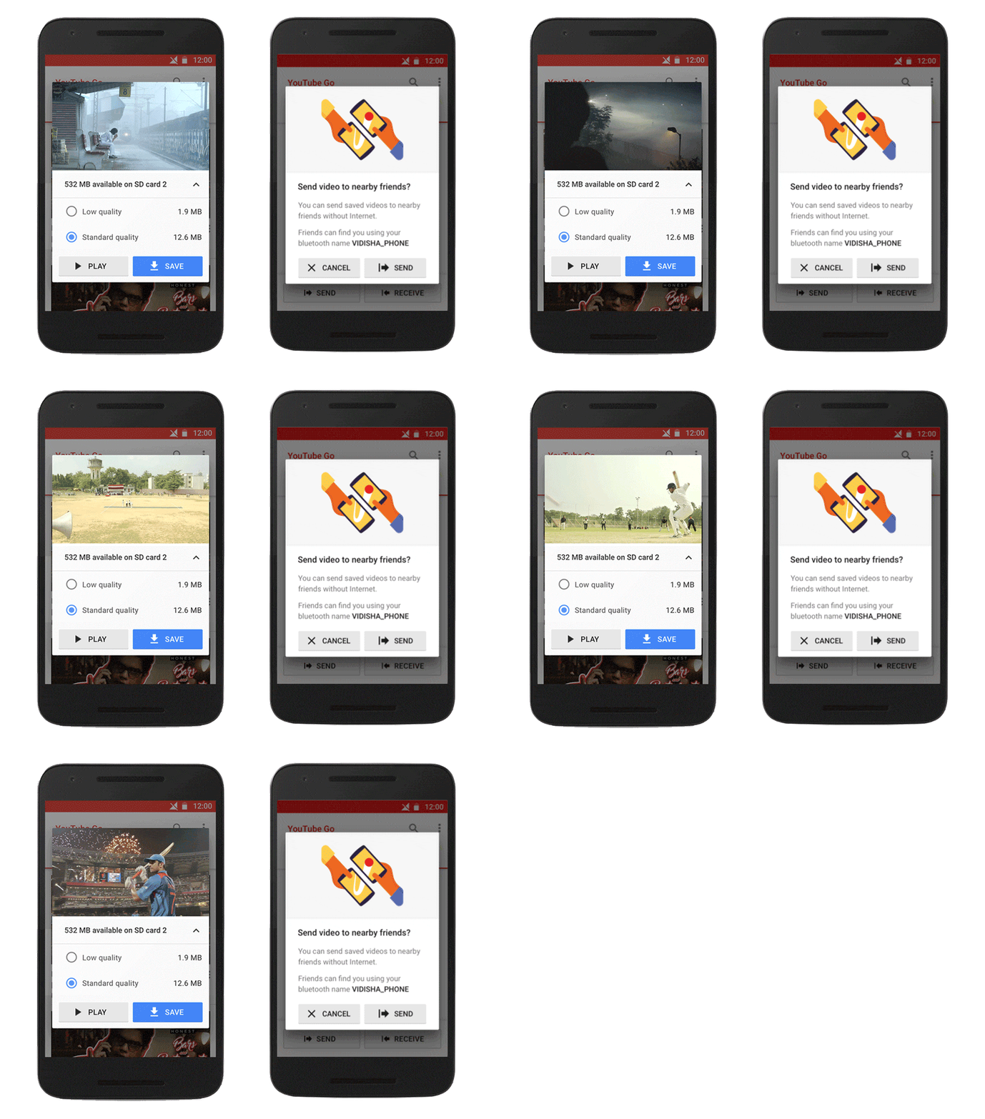
Many big companies understand the problem of connectivity and are trying to adapt to such situations. YouTube Go is an excellent example of a mobile app designed around connectivity constraints. The app lets users preview videos first and to select a video’s file size before saving it offline to watch later. It also has a great feature that lets users share videos easily with friends and family nearby, without using any data.
You might also like: Designing for the Next Billion Users.
9. Cashless payments
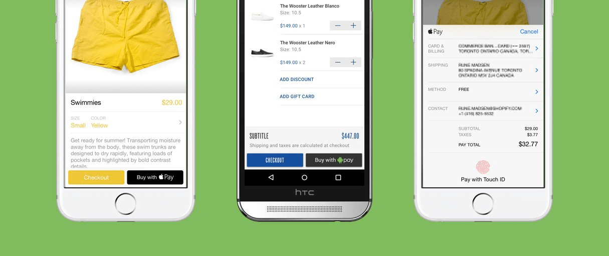
In 2018 we’re continuing to see that cash is no longer king, and cashless payments are quickly becoming a new standard for many users. According to a report by Juniper Research, the number of Apple Pay and Android Pay users has reached 86 and 24 million, respectively. The number of people who use cashless payments almost doubled in 2017.

Cashless payments are so powerful that they’re quickly changing the economic environment in many regions of the world. For example, in China cashless payments are becoming the prefered method of payment.
What does it mean for mobile app developers? It means that in 2018, Apple Pay and Android Pay should be supported by default in our apps and websites.
10. Augmented reality
AR is quickly breaking through into mainstream culture. At the recent Facebook F8 conference for developers, Mark Zuckerberg claimed that soon all screens will be replaced by lenses for the ultimate AR experience. Considering the work Google, Apple, Facebook, and Microsoft do in this field, it’s very likely that this statement will turn out to be true. And while the dominance of mobile phones won’t change anytime soon, we’ll see dramatic growth in augmented reality apps for mobile devices.
Technology is ready to accept AR
Today it’s easier than ever to create an AR experience. First, the processing power of modern mobile devices paired with Retina displays and cameras with high resolution allows designers to create impressive AR apps. Second, Apple and Google released AR frameworks (ARKit and ARCore) that simplify the process of creating AR apps.
AR is embedded in mobile platforms
Another great thing about AR is that it’s possible to experience augmented reality without installing anything. Some core AR apps are built into some mobile platforms.
For example, at the recent Google I/O, Google demonstrated a new generation of Google Lens. The app provides a lot of new features such as style match that will help users look up visually similar furniture and clothing.

AR is universal
The AR experience can be used both for entertainment and for solving real problems. As entertainment, AR is just fun—most of us are familiar with Pokemon Go and Snap Lenses, which are great examples of how fun an AR experience can be.

But in addition to being fun, AR is quickly becoming a technology that solves real problems and delivers real value for users . For example, Air Measure makes it possible to measure the real-world objects without a physical measurement tape.

Bonus: Redesign for the design process
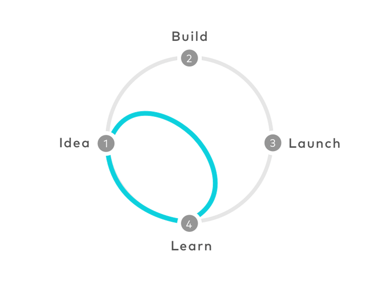
This is the year that designers redesign the design process. The need to reduce the time-to-market without sacrificing the quality of a product means mobile app designers are focused on rapid prototyping—cycles of iterations and evolving prototyping methods integrated with cycles of user testing (check out some great prototyping tools to help with this).
During each cycle, the team creates a prototype for a product and validates it with stakeholders and real users. In each cycle of validation, designers use sophisticated prototyping tools and take advantages of design sprints.
Another significant shift is in the way product designers communicate with their users. Companies have become much more open to listening to feedback from customers. Many product creators now incorporate a direct channel of communication with users in their app.
You might also like: What Are Design Sprints and Should You Be Running Them?
A changing industry
The mobile industry is changing, pushing the boundaries of how we create digital experiences. Without any doubt, we’ll continue to see amazing innovations in the coming years.
But even as our understanding of design transforms, it’s important to remember that the mission of the designer should always stay the same: design exists to make people’s lives better. With these new trends emerging in 2018, mobile designers are trying to do just that.
Read more
- Top Ecommerce Resources for September
- 9 Web Design Conferences to Supercharge Your 2018
- Top Ecommerce Web Design Trends for March
- How to Integrate Shopify into your Client's WordPress Website with Zillacommerce
- Working With Technology Clients: Strategies, Apps, and Themes to Consider
- 14 Image Tools for Web Developers in 2017
- Top Ecommerce Web Design Trends from January
- Top Ecommerce Resources for December
- The 15 Web Design Books of 2018 You Can’t Afford to Miss
What trends are changing the way you design for mobile? Tell us in the comments below!

