As a freelancer or agency, your portfolio website has the power to be your most valuable asset for finding new clients.
When business owners are looking for a web designer, they will often rely on online research to build their short-list of potential consultants. Having a well-thought out portfolio is crucial for differentiating yourself in these situations as it can showcase the quality of your work, establish a baseline level of trust, and build some initial interest with a prospective client without ever engaging with them directly.
But what good does that interest serve if your prospects never end up reaching out to you?
That’s where your contact page comes in. In contrast to being a simple landing page, when done right, these simple form-based pages allow you to capture interested prospects directly from your portfolio, while also streamlining your process for vetting and prioritizing those prospects.
In this article, you’ll learn how to transform your standard contact page into the most valuable part of your website, and discover how to start using it to land new clients today.
You might also like: How to Create a Compelling Web Design Portfolio
Why your contact page is so important
At its core, your contact page is a simple web page that features a lead capture form, designed for client acquisition. You more than likely already have a very simplified version of this form on your site, which probably looks something like this:
These contact forms are quite common on freelancer and agency websites, but are mostly added as an afterthought without much consideration about their purpose or impact. While simple forms like the one above does give your prospects an opportunity to reach out to you, they’re often not compelling enough to persuade your visitors to actually do so. And even when someone does fill out your basic form, you’ll often end up with a vague response like this:
It doesn’t make sense for you to devote the same amount of time to every prospect that comes through your website. A response like the one above can take hours, or even days, of back and forth communication before you fully understand the scope of the project, and identify whether your prospect is a good fit for your business.
Rather than opting for the status quo, you should put in the effort to create a contact form that is elegantly designed to extract the most relevant information from your prospect. This proactive information gathering allows you to make an educated decision about working with them, before wasting any time writing proposals or attending introductory meetings. Having an established process like this, might seem like overkill to some, but it can be exceptionally beneficial if you’re a longtime freelancer, or if you work at an agency that receives a substantial amount of leads through your portfolio site.
You might also like: How to Build a Great Design Portfolio — Shopify Designers Weigh In
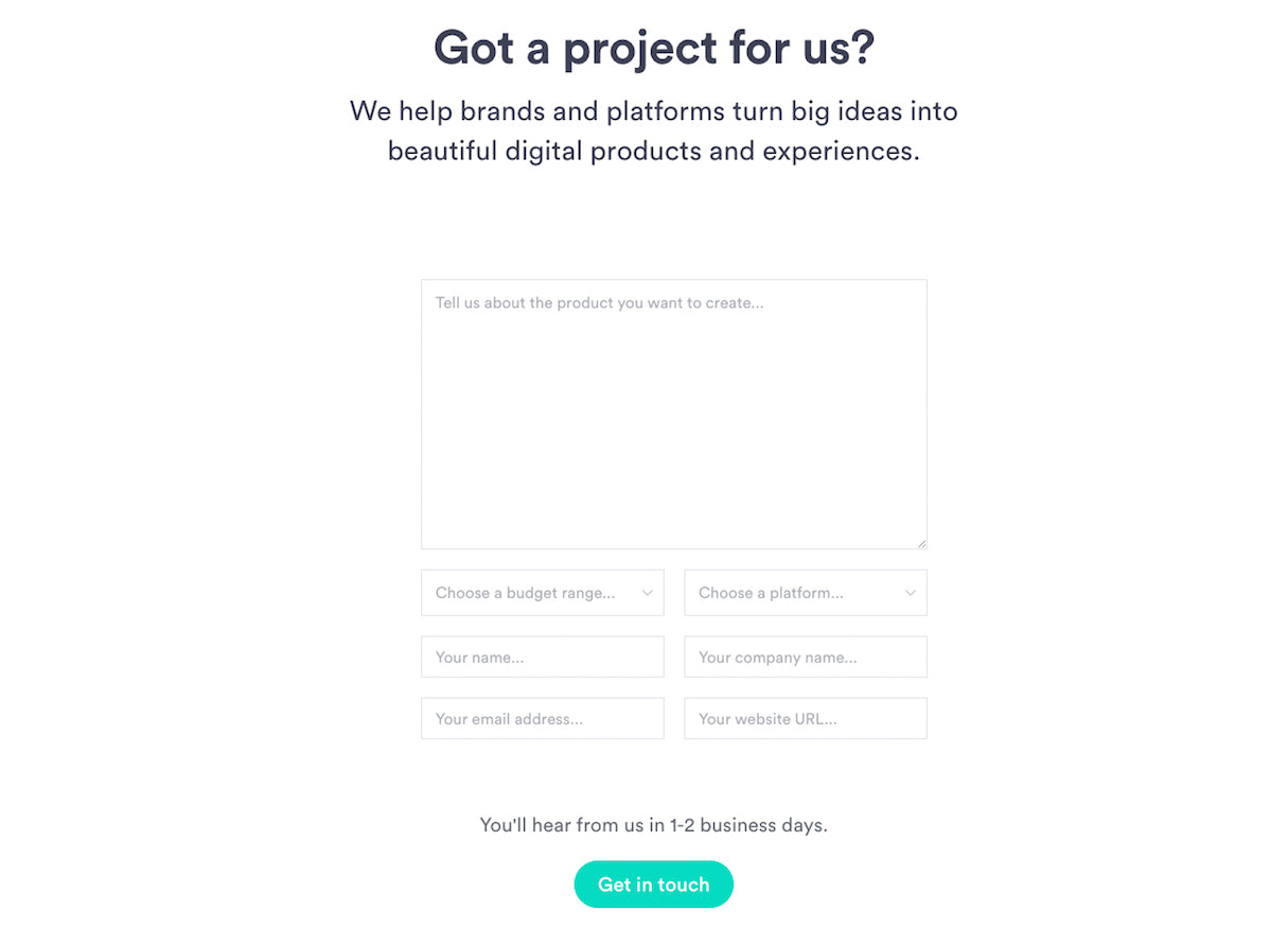
You can see this process in action in the example above. Design agency Pixel Union has put together a beautiful contact form that is not only visually consistent with the rest of their website, but also asks the right amount and type of questions in order to effectively evaluate prospects for fit.
The benefits of adding a detailed form like this to your portfolio don’t end there, they can also add a ton of value for your business by:
- Optimizing your portfolio site for inbound lead acquisition
- Allowing you to capture more information about the prospects in your sales pipeline
- Helping you better understand a prospect’s needs, challenges, and context before talking to them
- Streamlining your client qualification process so you know which prospective clients to prioritize
But above all, strategically planning out your contact page form will help you identify potentially successful and profitable relationships more quickly — ultimately saving you time, energy, and money.
Optimizing your contact page
It takes some proactive and strategic thinking to transform your standard contact page into a lead generation and qualification machine. It’s important that you carefully consider all aspects of this page, and how they interact with one another, just as you would any other area of your portfolio site.
In order to optimize your contact page and encourage submissions, you’ll need to design it with the intent of lessening user friction — the actual or perceived amount of time and effort it takes to complete your form. At the same time, your form also needs to gather enough information to qualify your prospects. The balance between these two needs can be a tricky one, but it’s not impossible.
Here are a few things you should consider in order to avoid unnecessary friction, and qualify prospects when creating your contact form:
1. Provide context for the form
It’s important to provide context to your site visitors whenever you want them to take action — and your contact page is no different. If you want a prospective client to fill out your form, you’re going to have to convince them why they should. Some of the best contact pages I’ve seen accomplish this by including some clever copy before the form, in order to persuade visitors to take action.
This part of the contact page can often be overlooked, but it shouldn’t be. Providing context around the contact form will help you establish expectations with your prospect and allow you to overcome any perceived friction or risk associated with the form.
At the very least, I would recommend including the following in your pre-form copy:
- A gesture of appreciation — Thank your prospects for their interest in your business and let them know you’re excited to work with them.
- An explanation of the form’s purpose — Describe why filling out the form is important for the client onboarding process. Take the perspective of the client when framing this part, by telling them that this detailed form will simplify the process of working together and give you enough information to be truly beneficial for their business.
- An expectation of their time investment — Let them know how long it’s going to take to complete the form before they start. This will help reduce any perceived friction associated with the length of the form (this is especially important for longer contact forms).
In the example below, Shopify Expert and design agency Lucid has included some succinct, but compelling copy in their contact form that is able to communicate the value of the form, the length of time it’ll take to complete, as well as their appreciation for the prospect’s initial interest.
It’s also a good idea to let potential prospects know if you aren’t currently taking any new clients. That way expectations are clearly established upfront and neither of you will be wasting time by starting a conversation that won’t lead anywhere, any time soon. You can see an example of this type of messaging on design agency and Shopify Expert Shopify Ninjas’ contact form (shown below).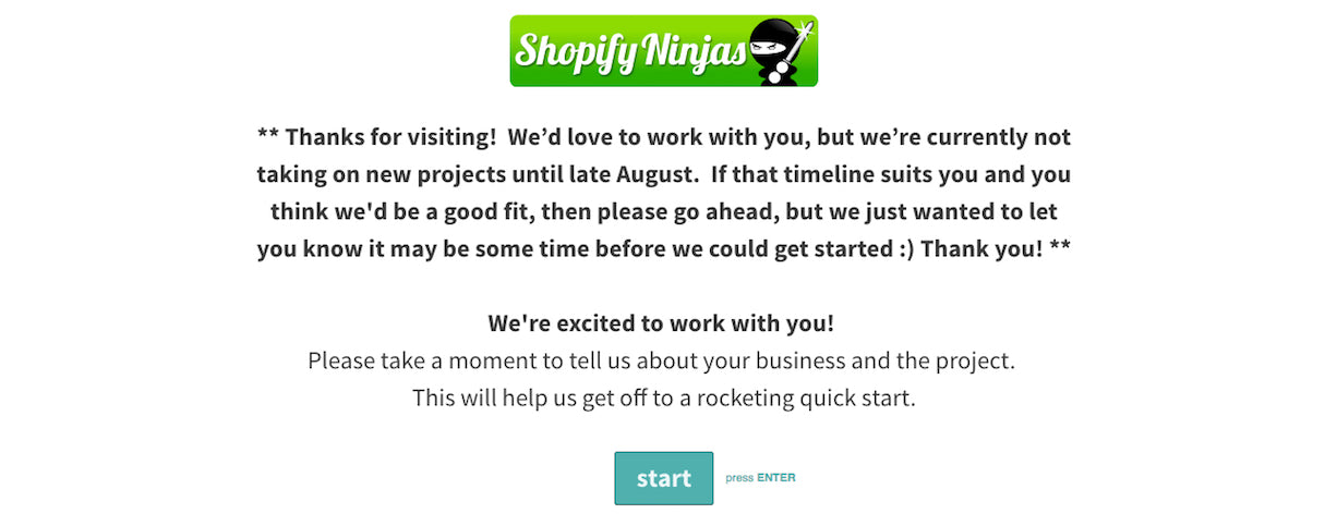
2. Ask the right questions
We’ve all seen the status quo for contact pages: the “name, email, memo” format that appears on most websites. While you may be able to get some information from these questions, they are really the bare minimum and won’t provide you with enough detail to make a sound decision about your prospect.
It’s important that you think about your contact form questions strategically.Try thinking of the form as the starting of your project or design brief — you want to capture enough details that you have a baseline understanding of their request, but not so much that you scare them off.
A good rule of thumb is to include one to three questions from each of the following sections:
Shopify Expert and development agency Disco have broken down their contact form using this very same formula. This ensures they start a new client relationship with a solid understanding of their business and project, before deciding whether or not to invest the effort into pursuing the job.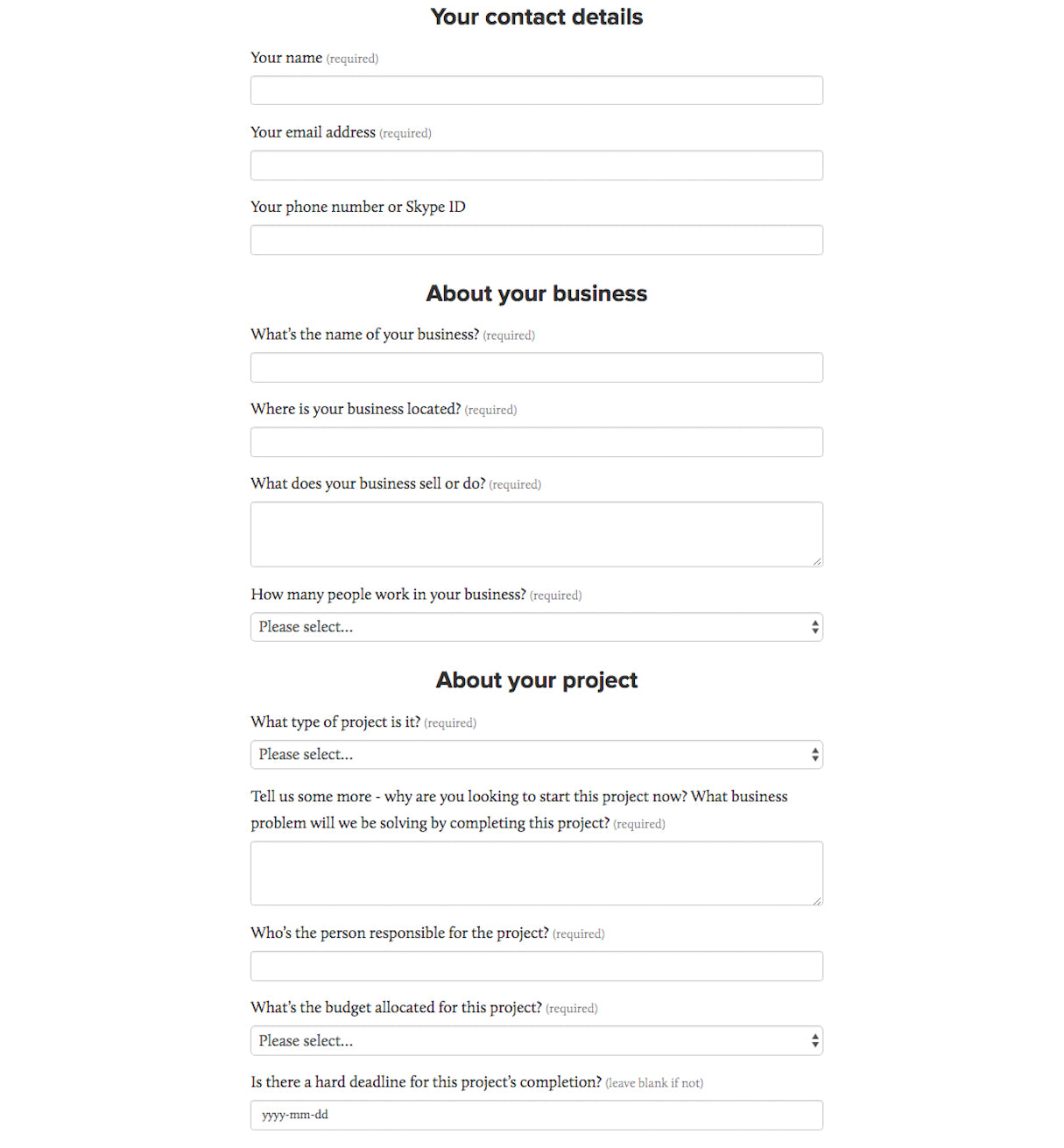
It’s important to remember that just because you ask the right questions, doesn’t mean your prospect will fill out the form correctly or entirely. Some clients will not have all the answers you’re looking for right off the bat, so it’s important to make non-essential questions not mandatory if you want to increase the likelihood that the form will be completed.
3. Ask questions the right way
While it’s important to be strategic about what questions you ask, it’s equally important to consider how you ask those questions. The format of your questions can directly impact the level of friction felt by the user, which in turn will influence the likelihood of a site visitor completing your contact form.
In his online course, Unbounce’s Oli Gardner talks about how one of the major sources of user friction in lead generation forms stems from the style of questions used within the form itself. While the course focuses primarily on forms in a broad sense, his lessons can be directly applied to your contact page form.
For example, including too many open-ended questions on your form can leave prospects spending more time thinking about their responses and not actually responding. If they end up wasting too much effort planning out their answer, it’s more likely that they’ll just exit without giving you one at all.
To keep this from happening on your contact form, simplify their thought process by swapping open-ended questions with drop-down menus or radio buttons that present a set amount of options. This will instantly remove any unnecessary friction from an open field and make it easier for a prospect to fill out your form quickly.
Ecommerce consultant and Shopify Expert Kurt Elster uses this approach in various sections of his contact form (shown below), which makes filling it out a breeze.
You should also ensure that you don’t limit prospects to a single response for questions where they may have multiple answers. Your “project type/needs” question is the perfect example of a section where your prospect may actually have multiple responses. Use radio buttons, as shown in Lucid’s form below, to make it easier for the prospect to select all options that apply.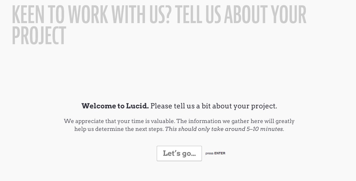
Just be careful because, according to Gardner, drop-down menus and radio buttons can actually increase friction when they don’t include a reasonable option for the user. Thus, it’s mandatory that you always add an “Other” option for those special use cases.
4. Add some social proof
We’ve all heard it before: social proof can help build trust with users. You probably already use social proof on your portfolio site within case studies and on your client roster page, but you can also leverage its influential power on your contact page.
Even after reviewing your portfolio of work and navigating over to your contact page, your prospects may still feel uncertain about reaching out to you. One way to combat this is by adding a few client testimonials above or below your contact form, to help remove any of these worries or doubts.
Having other business owners share the positive experiences they’ve had working with you will not only lend to your perceived credibility, but it will also help even the biggest skeptic feel more comfortable entrusting you with their business.
Having these endorsements directly on your contact page will help remove any unnecessary concerns about your business on the spot, which ultimately reduces friction and can lead to increased form submissions.
Eastside Co, design agency and Shopify Expert, did this very thing when launching their newly designed contact page earlier this year (shown below).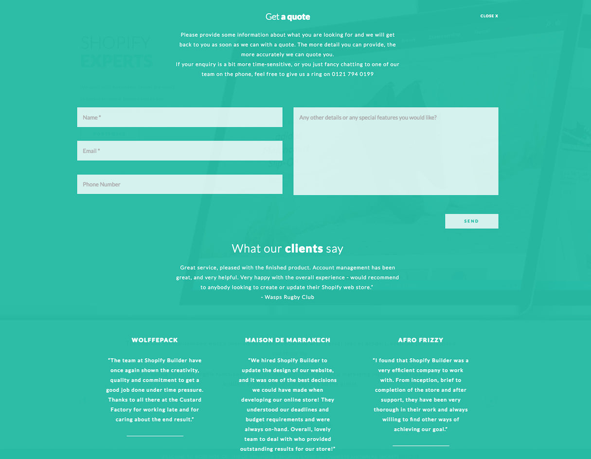
There are also a ton of other trust elements you can add to your contact page, if you don’t have access to client testimonials. Here’s some for your consideration:
- Client logos — Build your reputation by including recognizable logos from clients you’ve worked with in the past.
- Awards — Demonstrate your proficiency as a designer by listing any awards that you’ve won over the years.
- Samples of previous work — At the very least, you can include thumbnail images of some of your best designs to continuously demonstrate your skill during the form submission process.
5. Consider the length of your contact form
So far, we’ve focused on the content of your form and its impact on the overall effectiveness of your contact page, but the way in which you design your form is important as well.
One of the biggest design decisions that can influence a prospect’s assessment of friction is the length of your contact form.
Form length has an interesting correlation with lead quality. In general, the shorter the form, the easier it is to complete and the more prospects you’ll likely receive. While in many cases, more submissions is a good thing, you’ll be more likely to generate highly qualified prospects with a more detailed form.
The decision to go long or short will ultimately depend on the type of strategy you’re trying to pursue. Here’s a little insight into both:
The case for the short form
If you’re new to the freelance world and are looking to land your first few clients, it might make sense to opt for a shorter form length with fewer questions. A reduced form size will eliminate a lot of friction from the submission process, and help you get more prospects in your sales pipeline.
If you do opt for the short form, make sure to include the essential contact information section, as well as a few qualifying questions from the business/project sections so you have at least some information to evaluate the client.
Here’s an example of a great, simple contact page form from designer Jeffrey Zeldman’s portfolio site (bonus points for the budget slider):
Read more
- The Secret to Persuading Clients to Hire Your Design Firm
- How to Host a Webinar That Attracts Clients
- Cold Outreach: How to Build Warm Relationships with Potential Clients
- The Importance of Investing in Your Own Website
- How to Create a Client Intake Process That Saves You Time and Headaches
- Why You Should Add a Content Strategist to Your Design or Development Team
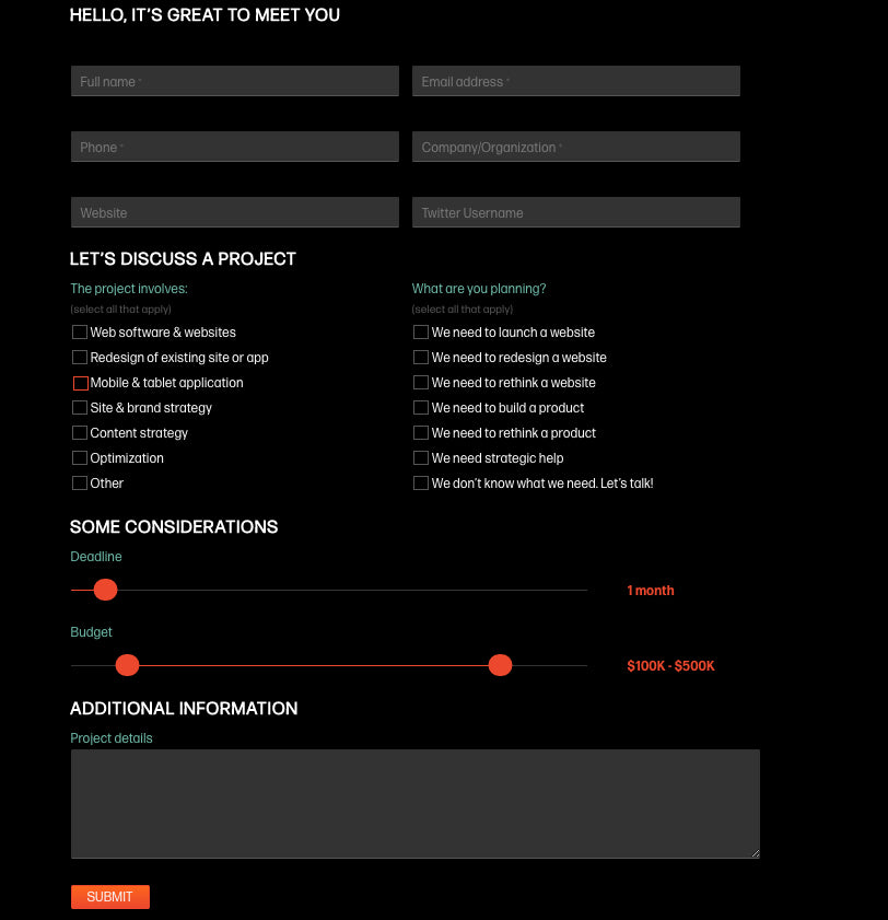
The case for the long form
On the other hand if you’re an experienced freelancer or work at an agency, you’ll probably be looking for a higher quality of prospect for your sales pipeline. This can be accomplished by using a longer, more detailed form. The length of these forms will help you weed out any prospects who aren’t serious about hiring you, while giving you enough information to qualify prospects before deciding to continue the conversation.
If you opt for the longer form, I’d recommend breaking the process into steps, and including a progress bar to show prospective clients how far along they are as they complete the form. By dividing up questions, your lengthy form will appear much more manageable, which will reduce the perceived amount of effort needed from your prospects.
I’ve include these examples previously in this article, but both Lucid and Shopify Ninja’s contact forms demonstrate some good best practices for dealing with long form lengths (they are a little too long for me to show within this article effectively, check out their respective sites and see them for yourself).
6. Test and iterate your form
The recommendations above are general best practices commonly seen across the industry. However, this does not mean that they will be the best solution for every specific situation.
It’s important to consider what will work best for your business when building your contact page form. As with any part of your website, you should be consistently gathering research around the effectiveness of your form for future optimization.
In order to collect some quantitative results, I’d recommend running your contact form through some simple A/B tests. By measuring the impact of small, incremental changes on form completion rates, over time you’ll be able to create a form that is fully optimized for submissions.
Here are some resources for learning more about running your own A/B test:
- What is A/B Testing?
- How A/B Testing Will Make You a Better Web Designer
- How to A/B Test Your Forms for Maximum Conversion
- Case Study: 30% More Leads By A/B Testing a Contact Form
- Form Length Isn’t Everything: 3 Other Ways to Optimize Your Forms for Conversions
You can also uncover a lot of insight by gathering qualitative feedback from existing clients who were onboarded through your contact page. Try chatting with them in-person, or seeing if they’d be willing to fill out a follow-up survey mid-way through or near the end of your project work. These anecdotal insights can uncover some interesting perspectives and ideas about your contact form.
Regardless of how you decide to gather insight on the usability of your form, it’s important that you invest in conducting this research to simply test your assumptions and optimize based on your findings.
Tools for creating your contact form
If you’re looking to set up a form on your own portfolio website, there are a variety of tools available for simplifying the process.
While you can create a simple form yourself using basic HTML and PHP, sometimes it’s just easier to use an online form builder instead. If you’re looking for a tool for this purpose, here are few of my favorites:
- TypeForm — You can easily create beautiful, customized forms, surveys, and quizzes using TypeForm. Typeform offers a ton of personalization and customization options to help you create the form of your dreams.
- Wufoo — Another great option for automated form building, Wufoo allows you to host forms on their site or embedded within your own. They offer more than 300 templates that you can start with, or that you can code your own design too. You can try them out on your site for free, but only up to 100 entries.
- Hubspot — Hubspot is much more than just an online form builder. This tool is great for creating custom lead capture forms for your site, while also offering CRM functionality for keeping track of those leads in your salespipeline.
There are also a few tools you can use to integrate your form data with other software services you might be using, such as mailing automation and CRM software. Here are a few of my favorites:
- Zapier — A great workflow automation app that makes it easy for your various platforms to share data and talk to one another. Zapier integrates with more than 500 web applications.
- IFTT — Another workflow automation app that allows you to connect various web applications and push responses from one another. IFTT has less integrations than Zapier, but is available to use largely for free.
Transform your contact page today
Despite the tendency to overlook the contact page, you should treat yours with the same devotion as the rest of your portfolio site. Investing in an optimized contact page can result in a greater amount of leads for your business, and a sophisticated process for qualifying those leads.

