This is the third and final post in our series on migrating our Shopify apps to Shopify’s Polaris framework. If you haven’t read our earlier posts, we’d encourage starting with part one: What Led us to Consider Polaris, Shopify’s Design System.
Reporting is a critical part of any Shopify app — any admin installing the app is going to want to see how the app is performing, what data is available from the app, how they extract that data to make use of it, etc.
In the case of our apps, the reports typically have to do with user engagement and are therefore an extremely important part of the value we offer our customers. Store admins use these reports both to understand how their customers are engaging with their store, and to back up their business decisions.
In this post, we will go over the design of the general report component that sits at the core of all of the reports that we expose, how the component evolved to its current shape, and how Polaris’s generic definition can help anyone build robust and diverse report views.
You might also like: Introducing New Updates to Polaris: More Ways to Build a Great App UI.
Setting up our reporting
To start, we had some expectations for what a reasonably complete, generic Report component would look like. We believed that it:
- Should offer a structured view of data where one attribute can clearly be demarcated from another.
- Should allow any type of data. It should even accept conditional markup that appears on the basis of some condition.
- Should allow drilling down into an aspect of the data presented.
- Should handle pagination and user navigation between pages.
- Should handle empty state and loading state.
For reporting needs, Polaris has the DataTable and ResourceList components. Shopify suggests that they should be used the following way:
“Data tables are used to organize and display all information from a data set. While a data visualization represents part of data set, a data table lets merchants view details from the entire set. This helps merchants compare and analyze the data.
“A resource list displays a collection of objects of the same type, like products or customers. The main job of a resource list is to help merchants find an object and navigate to a full-page representation of it.”
In light of what was available with Polaris, we segregated our reports from a representation point of view and came up with three distinct categories :
- A summarized metrics report. This could be used for a report for the conversion rates and revenue driven by each of our widgets on the merchant’s site. This fits very nicely with the
DataTablespec. - A longer report about a particular aspect of the store. This could be a report on wish-listed products. This report exposes the products most wish-listed, and lets the merchant dive into each product specifically to see all the users who have that product in their wish list. This use-case aligns well with the
ResourceListspec. - A log report. This could be a log of all emails sent, when and how many were sent, etc. This use-case doesn’t quite fit with either of the Polaris options per se but can be accomplished with either of them.
The decision of which implementation to pick was a complexity that we wanted to absorb into the design of our report component. In other words, someone building a report shouldn’t need to care how it is going to get implemented underneath.
You might also like: What Led us to Consider Polaris, Shopify’s Design System.
Using render functions
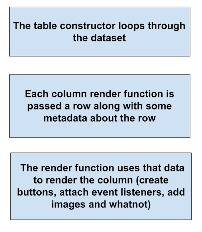
One crucial thing to notice is that each of these three underlying implementations requires a configurable markup. This markup can either be directly passed as a prop or can be returned from functions that are passed one row of the dataset at a time. These functions are called render functions. Render functions are completely flexible, since they don’t enforce any constraints on the kinds of things one can render in the DOM.

Once we have these functions in place, its very easy to plug them into a DataTable, a ResourceList, or even a raw HTML table—it becomes simply a matter of accepting a prop from the table consumer declaring the features it needs from the table component, and using that to make a decision about which implementation to choose. Examples of features can be pagination, sorting, filtering, bulk actions, or totalling.
Below is an example schema to decide which implementation to use for a report:
{

"DataTable": ["totalling", "sorting"],

"ResourceList" : ["pagination", "filtering", "bulk-actions"],

"GeneralisedTable" : ["custom-headers", "long-grid-table"]

}
Implementation
To provide as much flexibility at this layer as possible, we started with a good ol’ table with the standard table markup in conjunction with Polaris helpers (Card, Stack, Pagination and SkeletonDisplayText component).
We got help in the table styling from Uptown CSS, built by the amazing folks over at ShopPad. Once this component was in place, we created a GeneralReport component that wrapped around it, and brought more structure and generalization for our reports using the schema shown above. The end result was a powerful yet flexible API that supports a wide variety of reporting needs.

We have added a link to the raw table implementation that one can use in conjunction with the Polaris DataTable and ResourceList components. Below is what a call to GeneralisedTable looks like:
| var renderFunctions = [ | |
| function(item, rowIndex, offset){return offset + rowIndex + 1;}, | |
| function(item){ | |
| return <a target="_blank" href={item.a}>{item.b}</a> | |
| }, | |
| function(item){return item.c} | |
| ]; | |
| var tableHeaders = ["S.No", "Header 1", "Header 2"]; | |
| var items = [{a: "X", b: "Y", c: "Z"}]; | |
| <GeneralisedTable | |
| noDataPlaceholderText="No data found" | |
| doPagination={false} | |
| tableData={items} | |
| attributeRenderFunctions={renderFunctions} | |
| tableHeaders={tableHeaders} | |
| /> |
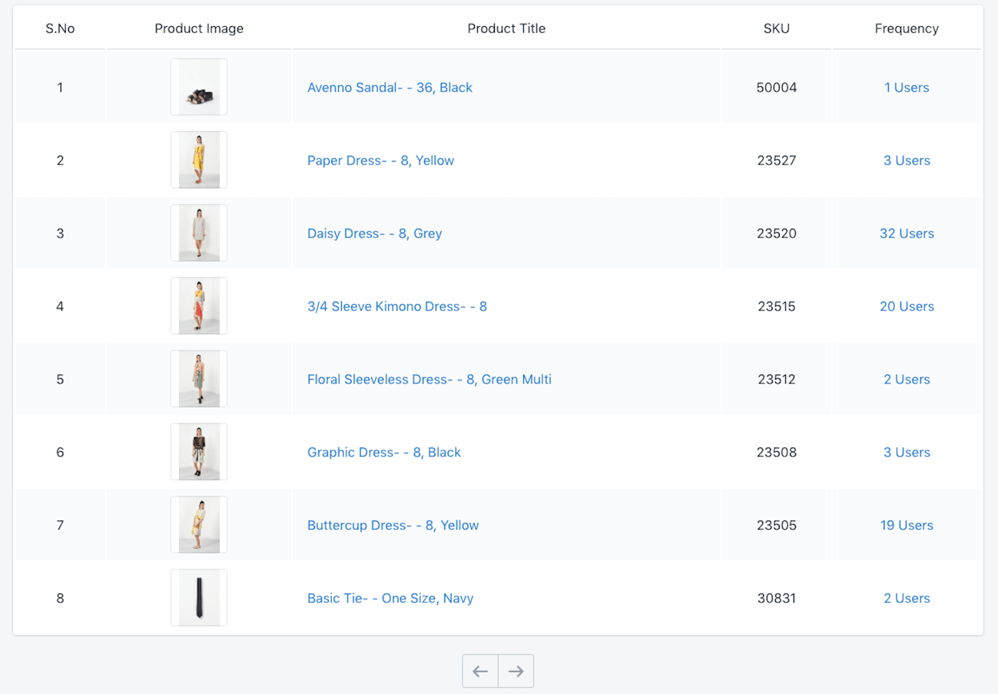
And how the table from the gist renders:

The complete table API and its code is available as a gist. Feel free to extend and/or tweak it to your needs.
You might also like: Upgrade to Shopify Polaris : The Nuts and Bolts of our Implementation.
Continuing with Polaris
This is just the beginning of our work with Polaris, but we feel really good about how solid a foundation it has given us to build on. We are working on some very exciting interactive capabilities as part of our dashboard, and we look forward to sharing that part of the journey with you in a future post. We hope these posts were useful as you consider using Polaris for your own admin experience.
We are always eager to help out and be involved in the developer community, so please drop us a note if you’d like to chat about any of this. Good luck implementing Polaris on your own apps!
Read more
- Top App Customer Service: 4 Techniques To Use as Soon as Your App Is Installed
- 4 Must-Read Shopify Docs to Maximize your Success on the Shopify App Store
- How to Build Powerful In-App Surveys: Put the User First
- How to Level Up Your App with Theme App Extensions
- App Development: Working Together for the Greater Good
- Upgrade to Shopify Polaris : The Nuts and Bolts of our Implementation
- Persistence Matters: 6 Lessons From My First 6 Months on the Shopify App Store
- Free Webinar] Building Great App User Interfaces with Polaris
How have you implemented Polaris in your app design? Share your experience in the comments below!

