Since we launched the 2014-2015 Shopify Ecommerce Design Awards, we’ve been throwing down a challenge for you to submit your best builds for the design battle of the year.
Our goal is to celebrate the talented designers and developers that create and customize themes for the Shopify platform, and to showcase ecommerce sites that display exceptional design, creativity, and usability. Submit stores with show-stopping aesthetics, seamless integrations, and flawless functionality that was previously thought impossible on a Shopify store, and you could win a $5,000 cash prize.
Here to help is Vitaly Friedman — editor-in-chief of Smashing Magazine and one of the judges for the 2014-2014 Shopify Ecommerce Design Awards. Vitaly is a writer, speaker, and author who runs responsive Web design workshops and online workshops. We sat down with him to find out what he looks for in a winning design. Read to the end to find out what advice he has to give for anyone entering the competition!

Thanks for talking with us, Vitaly. When it comes to ecommerce design, what are some essential features that you think every site should have?
Well I think it’s very important for every ecommerce site to focus on the most important tasks like checkout, of course. It depends on how you design it. If you can optimize the process, in terms of how fast it is in terms of performance, but also the fields you have to complete. Very often you can pre-fill lots of import fields just by asking the right questions at the right time, so you can actually minimize the input really fast. Of course it comes back to how you move people along your site through the process. If it’s a really smooth experience, you can finish the checkout within 30-35 seconds. That’s what you should be striving for in checkout.
What’s an example of an ecommerce store you’ve seen recently that’s doing something right?
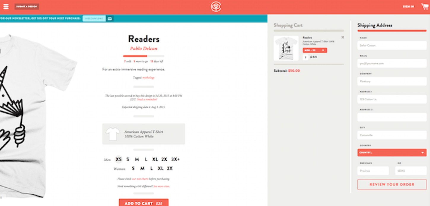
There’s actually an ecommerce site called cottonbureau.com, they’re selling tshirts. What’s interesting is that they actually use off canister patterns that are mostly used for navigation, in the checkout. So when you add things to the cart, it also slides from the right to the left. It’s natively designed for any experience, whether it’s on tablet or mobile or desktop because you can just swipe. If you’re on desktop, it’s not like you have a very long page — you basically have everything you need, very nice and neatly and very fast. That’s a good thing.

What do you think is the biggest mistake people make when designing websites?
I think it’s very common to prioritize visual content over everything else, but I think it’s important to deliver some content very quickly. Just prioritize performance before anything else. This means that web forms have to come a little later on their first visit. The same goes for basically every blocking JavaScript that is not absolutely necessary for the website to render. If you can delay that, and deliver content as fast as you can, it’s going to be a better experience for users.
When you judge the Ecommerce Design Awards, what will you be looking for in a winner?
Oh, definitely the checkout process. Also the way the information is organized when it comes to selecting products. But I think that if you’ve found the product that you like, it’s really critical to focus on the way the checkout is designed. There are many ways of getting it wrong — either by using wrong patterns or not using convenient design patterns that would make it easier for users to checkout. There are also many things you can do right. There’s a lot of material out there about what you can do to improve checkout, from input placeholders, to floating label patterns, to better counterselector, to prefilling stuff, autocomplete, and other things like that.
What books and blogs should our partners be reading for inspiration?
I think when it comes to ecommerce, there are some reports from Baymard Institute in Denmark. They run lots of tracking and visibility studies across the top 100 ecommerce sites according to Alexa. They try to track and follow up on all the problems and common mistakes on those websites. Then they come up with reports on what works, what doesn’t work, what the users like, what they don’t like, and how you can improve things. It’s a no brainer. It’s great. It can apply to your work right away. This is definitely something to look out for.
What are your favourite sites to go to for design inspiration?
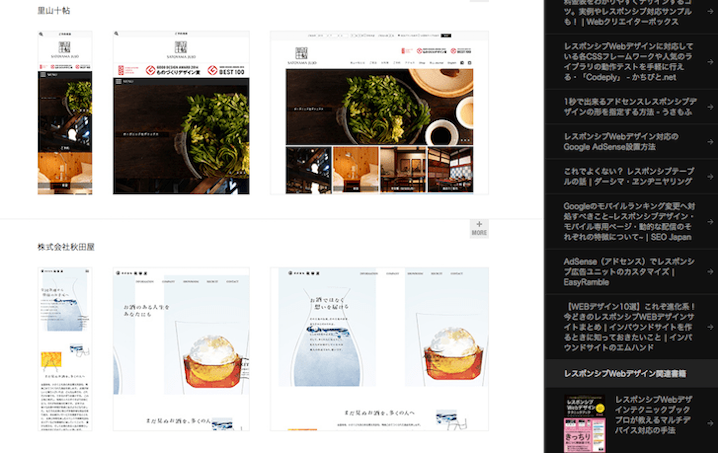
That’s a good question. I like going to Chinese and Japanese websites actually, there is a gallery of Japanese websites called RWD.japan. They collect different Japanese responsive websites. When you look at Asia, they have many websites optimized specifically for mobile first, and then they optimize for desktop later, while we tend to optimize for desktop first. They’ve made many design decisions and encountered many design challenges along the way. Many of the problems we’re exploring at the moment have been solved awhile back by them. It’s very interesting because you can see lots of problems being solved intelligently. They have a strong visual presence, so it’s very colourful, there are many moving elements. You can find really surprising things like responsive animation, where the animation changes based on the device you use. You have elements moving and transitioning. There’s a lot to learn from them.
Read more
- Top Ecommerce Resources for September
- Top Ecommerce Resources for October
- How to Direct, Control, and Hold Focus Through Design
- The 15 Web Design Books of 2018 You Can’t Afford to Miss
- Top Ecommerce Resources for July
- Top Ecommerce Resources for August
- Top Ecommerce Web Design Trends from January
- Top Ecommerce Resources for November
- Pitching Animation: How to Talk About Motion in a Design-Centric Way

What’s one thing that most people don’t know about you?
I think that many people don’t know that I don’t have a permanent residence. I’ve been travelling for a long time and actually gave up the idea of having an apartment more than a year ago. I try to spend a lot of time with people I care about most, but also getting to know new people and new cultures. It’s been really, really great. A bit stressful at times. You end up staying somewhere for 3-4 weeks, mostly using airbnb or staying with a friend. Unfortunately airbnb has become more expensive in the last year or so, so it’s not really like you’re saving money. Of course, travelling itself is quite expensive. But then you get to see new cultures, and new experiences, and that’s great — for awhile. But I guess at some point I will be settling, because I’m travelling a lot with my girlfriend, and sometimes you learn to appreciate the simple things. Knowing the grocery store that you’re going to go to, or finding a coffee place that you like. It always takes some time to figure out the logistics of every new place. It’s nice to be in a place and have it all figured out. I kind of appreciate that now.
What’s your advice for those entering the Design Awards Competition?
It would be really interesting to see some innovative ideas of what you can do with checkout and also product presentation. Very often it’s a very stupid, simple, generic design. It’s not necessarily bad, but it’s just generic. Make it better, more interesting, and help users to get through the checkout faster. I’d be really curious to find out what can be done here.
Thanks Vitaly!

