Announcing Online Store 2.0
Online Store 2.0 is an end-to-end overhaul of how themes are built at Shopify, launched June 2021. While the information in the following article is still correct, it doesn't account for Online Store 2.0 best practices, and may not include references to recent features or functionality. To learn more about how to build with Online Store 2.0, visit our updated documentation.
Visit docsImages are important to the user experience on websites—look no further than how often merchants request that their product images are zoomable (something you can achieve with jQuery image zoom). But with the shift to smaller devices, developers face new challenges to ensure images load quickly, regardless of screen size.
Images can make up the biggest part of a store’s page weight, and smartphone or tablet users can become easily frustrated with slow loading speeds. Customers give up when pages take too long to load, and research by Compuware, traced abandoned checkouts — a clear indication of revenue loss — to page load delays.
Decreasing these page load delays can dramatically increase merchant’s conversions and build brand trust. By allowing smaller images to load on smaller screens, you can create themes that will increase conversions for merchants and improve the user experience for customers.
This article will show you how to use responsive images to optimize custom themes so they load quickly on any sized screen.
Why images matter to clients and customers
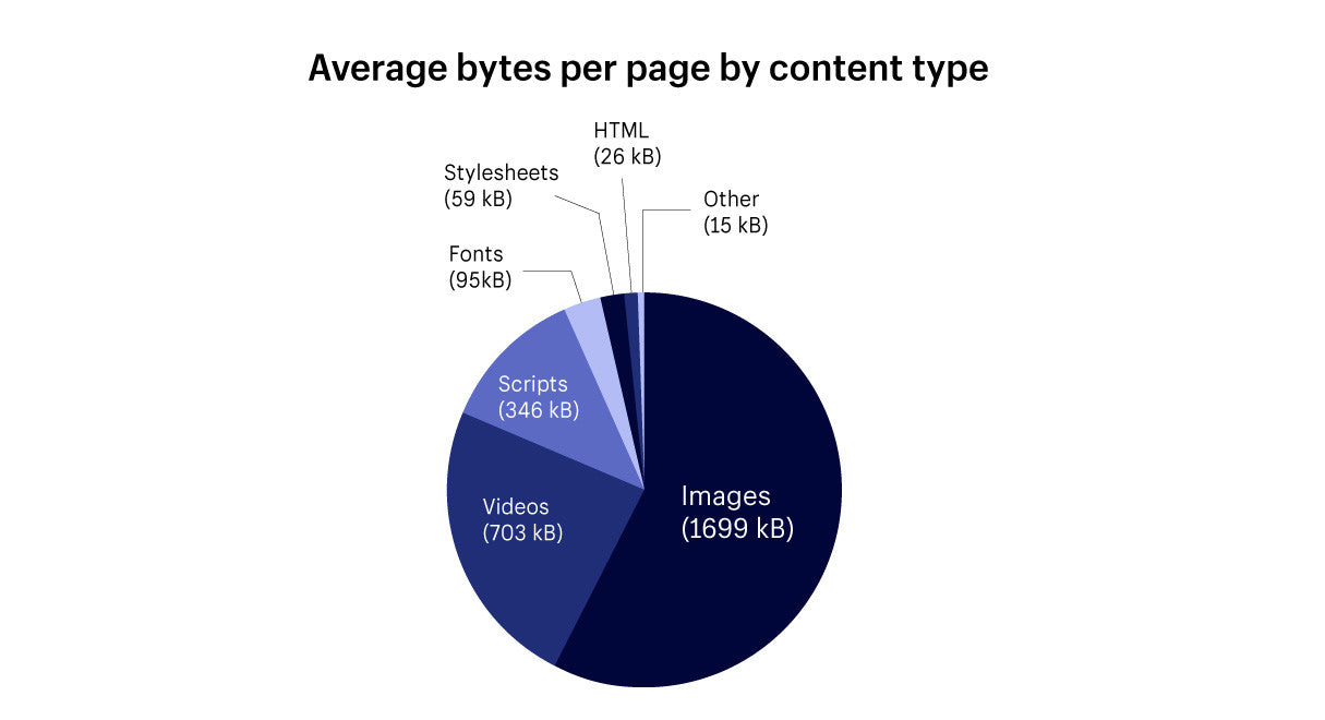
There are numerous other cases where image load times have proven to have a significant impact on a mobile user's experience. A team at Etsy found an increased bounce rate of 12 percent on mobile devices when they added 160KB of images to a page. A study by the HTTP archive showed that images take up the vast majority of the average web page.
 A graph demonstrating the average bytes per page in March 2017 (source: httparchive.org). Images make up the bulk weight of an average page.
Responsive images were introduced to ease loading times on smaller sized screens, and are natively supported in modern browsers using srcset, which allows the available images to be explicitly specified.
It’s also important for theme developers to consider an image responsive strategy, as a form of future-proofing, since merchants will need to support an ever growing and wide range of screen sizes, resolutions, and densities.
To reduce merchant effort and allow for more control over how images are displayed on differing screen sizes, Shopify introduced new properties for images earlier this year at Unite. Theme developers can now create different rules based on different attributes of the image object.
The new attributes that have been introduced are image.height, image.width and image.aspect_ratio. These attributes can be used with the regular browser image attribute srcset to load a specific size of an image, based on the screen size it’s displayed on. What’s very useful about the srcset attribute is that it will allow you to define a set of images the browser can choose between.
This means that smaller versions of an image can be loaded on smaller screens, thereby reducing the amount of time a browser spends loading a page.
The “old” method that Shopify uses to assign sizes to images is a named image filter. For example grande for images will display an image at up to 600 x 600 pixels, and large will display an image at up to 480 x 480 pixels. While these URL parameters are still valid, and will work on existing themes, they are being deprecated. Numeric parameters can specify exact dimensions in pixels for an image's width and height.
By creating a set of numeric parameters on your custom theme, based on how you think an image will appear on different sized screens, you can establish a more responsive system. Once an image loads on a screen, the browser will resize the image automatically according to the range of numerical parameters you have set up.
This means that you don’t need to upload multiple versions of the image in different sizes, as the images would resize automatically. Now theme developers can make more deliberate decisions on the best image size for their themes🚀
This means that you don’t need to upload multiple versions of the image in different sizes, as the images would resize automatically.
Once an image is uploaded, the theme will make a choice of which image to display, based on the predefined rules, in order to optimize for both speed and aesthetics. The effect is that theme developers can offer a more robust service to clients, and merchants can add large images without fear of affecting mobile performance .
.
You might also like: How to Optimize Themes for Performance.
How image responsiveness works — an example using Narrative
The first Shopify built theme to make use of responsive images in this way was Narrative, released in April this year. High resolution, full-screen imagery on the home-page was a huge priority to the developers who worked on Narrative, but this also needed to make sense on a smaller scale.
Having a more responsive hero slideshow on smaller screens meant looking at setting up a range of different width options. The correct width would be picked by the browser when the image was loaded, depending on the screen size and the range available. You can see the range of image widths the development team chose on line four below:
| <img class="slideshow__image slideshow__image--{{ block.id }} lazyload" | |
| src="{{ block.settings.image | img_url: '300x' }}" | |
| data-src="{{ img_url }}" | |
| data-widths="[540, 720, 900, 1080, 1296, 1512, 1728, 1944, 2048]" | |
| data-aspectratio="{{ block.settings.image.aspect_ratio }}" | |
| data-sizes="auto" | |
| data-parent-fit="cover" | |
| alt="{{ block.settings.image.alt | escape }}"> |
In this case, we can see there’s a image size range of minimum 540 pixels, to a max image width of 2048 pixels. With nine different options, a wide range of screen sizes are accommodated for. This ensures that the best version of the image is being displayed, no matter the context. It’s worth noting here that the maximum image size is 4472 pixels x 4472 pixels.
We can also see on the top two lines of the above snippet that a Lazysizes plugin is being used in combination with the src attribute. What this plugin does is temporarily preload a small image as a placeholder, while the correct image is loads. This reduces any time when a blank space would be shown where the slideshow should appear.
Lazysizes also takes care of pixel density. Many modern phones (like those with retina screens) have a pixel density of greater than one. This means that the screen size might nominally be 500 pixels wide, but if the pixel density is two, the best image to load would be one that’s 1,000 pixels wide.

When the home-page of Narrative loads, using the above configuration, the browser will carry out the following actions:
- Pre-load a low resolution image for the slideshow, almost like a placeholder.
- Examine the device/ screen width.
- Load the image referenced in the
data-widthslist that most closely matches the screen size.
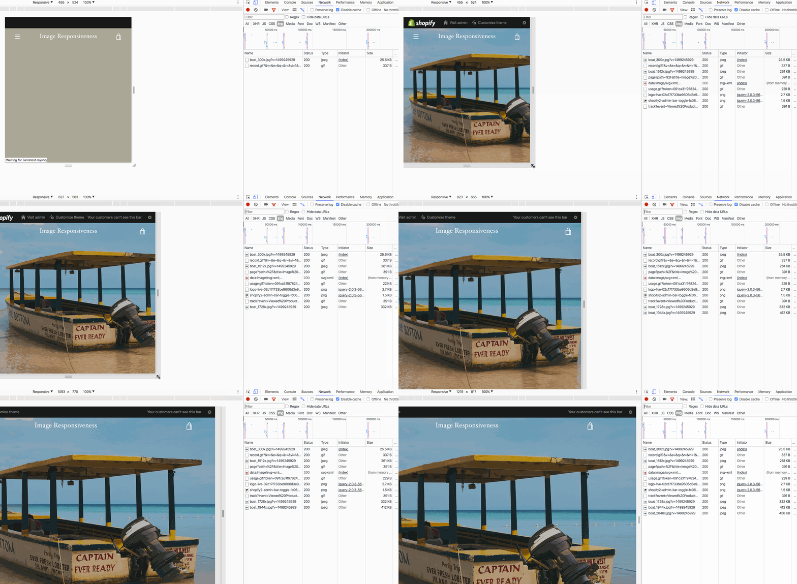
We can test to see if Narrative is loading the correct image size with Chrome’s Dev Tools, by increasing a responsive screen size and monitoring which files are being loaded.

We can see this in the animation above, when we look at the activity in the Dev Tools Console on the right. Here, I’m in the Network tab, and filtering by image, so that I’m only seeing images on the page being loaded.
When the page is loaded at the beginning, the smallest image is displayed by lazysizes, and then the specific image size for this screen size is loaded in.
As the screen size increases, larger images are loaded in, and you can see these arriving at the bottom of the console. Google’s documentation gives more details on using the Network Analysis Reference within Google Dev Tools.
You might also like: Building Narrative: Shopify's New Theme for Storytelling.
Moving forward with responsive images
Now that these new attributes are available, theme developers can use them to make images responsive on their existing themes. Following the launch of Narrative, Shopify’s theme developers now use these tools to update our own themes, such as Debut, Brooklyn, and others.
For example, Debut previously displayed images on a blog page at a fixed size of 345 pixels wide:
| <a href="{{ article.url }}" class="article__grid-image"> | |
| {{ article | img_url: '345x' | img_tag: article.title }} | |
| </a> |
Now however, we can set up a range of different sizes the browser will choose, according to the size of the image container:
| <a href="{{ article.url }}" class="article__grid-image"> | |
| <img id="{{ img_id }}" | |
| class="article__grid-image lazyload" | |
| src="{{ article.image | img_url: '300x300' }}" | |
| data-src="{{ img_url }}" | |
| data-widths="[180, 360, 540, 720, 900, 1080, 1296, 1512, 1728, 2048]" | |
| data-aspectratio="{{ article.image.aspect_ratio }}" | |
| data-sizes="auto" | |
| alt="{{ article.image.alt | escape }}"> | |
| </a> |
Here again, you can see that the lazysizes plug-in is pre-loading a smaller image before the correct image is loaded in, based on the size of the screen.
Auditing for images
When you’re building responsiveness into your custom themes, you should first audit your themes to see where responsive images make sense, and avoid over-complexity. On pages where very large images are not being displayed, you could keep the fixed dimensions of an image.
An example of this could be a cart page where images are not very large. Responsive images would only be necessary where you’re seeing large images, like on slideshows. Making informed decisions on where and when images should be responsive will help you develop the most streamlined themes possible.
You might also like: Enhancing the Ecommerce Experience: Recent Updates to Shopify’s Online Store and Liquid.
Further learning
Here’s a great list of resources for those interested in for learning more about working with responsive images: for those interested.
- Our own blog details some of the other recent updates to Liquid.
- W3 Schools give more background on using srcset.
- The Kissmetrics blogs outlines some issues around loading time.
- Another insightful article describing the challenges of responsive images.
Staying responsive
The examples we looked at above, show how responsive imagery can be achieved with Shopify themes. Implementing similar approaches on your own custom themes will improve the user-experience for the end customer, regardless which type of device they’re using.
The new additions to Liquid will allow you to provide clients with better stores, however it’s not a “one-size-fits-all” solution. By carefully approaching each page and considering how images should appear on smaller screens, you can develop your own responsive image strategy.
Read more
- How to Manipulate Images with the img_url Filter
- Build Forms on Shopify: How to Use Liquid to Build Robust Forms for Shopify Themes
- Introducing Online Store 2.0: What it Means For Developers
- How to Use Liquid to Create Custom Landing Page Templates
- How to Use Google Ads to Drive Traffic to Your Clients' Sites
- An Overview of Liquid: Shopify's Templating Language
- Using Placeholder Images for Products with the placeholder_svg_tag Filter
- Creating Dynamic Color Schemes with Theme Options and Presets
- 15 Unmissable Web Design Podcasts
How do you use image responsiveness to improve website design? Tell us in the comments section below.

