In an agile process, designers and developers aim to build prototypes and products quicker than ever. Long gone are the days of meticulously designing every pixel before testing a proof of concept. However, certain client deliverables help lead to a final product and are still highly effective throughout the design process, even if that process is accelerated.
In the early stages of a website or app, getting everyone on the same page regarding the architecture and primary functionality is crucial. Flowcharts, wireframes, and style guides can help clearly communicate plans to your team, client, and key stakeholders. The right design assets can help create those documents quickly, moving you towards prototype, development, beta, and launch.
Let’s look at some of the primary benefits of creating documents that may be used during the design process:
- Improve designer-client communication, with sign-offs on key deliverables, helping to facilitate a smooth process.
- Well-designed, consistent visuals speak to stakeholders and the general quality of work.
- Improve designer-developer communication, focusing on bridging the gap using clean, easy-to-follow visuals.
- Identify key functions and poking holes in ideas early, saves time later.
The Complete Guide to Web Design Project Management
Read our complete guide to web design project management for developers, designers, and marketers. Learn how to work with stakeholders, manage budgets, and keep your clients happy.
Learn moreIt’s all about the user
Before you get into creating any type of deliverable, you have to know who your demographic is and understand their needs and motivations. While the importance of a beautiful interface should not be lost, user experience and customer experience design put the people using your product first. An app for kindergartners is going to be quite different than one for baby boomers.
Stanford’s Design Thinking process puts this concept at the forefront by stressing that empathizing with the user is the first step in building something great. Only through this understanding can you truly see a product through your user’s eyes and get to the ideas that will best serve them. With this knowledge, you can move to creating documents that communicate your ideas to your audience, and those documents will play an important role in the design process.
Don't forget the importance of keeping track of your great work with a strong web design portfolio, though.
1. Starting with flowcharts
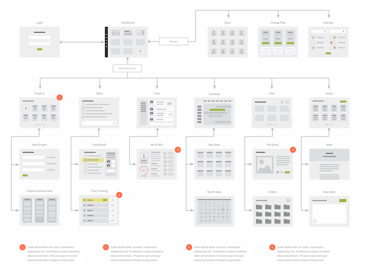
A flowchart, especially one including some visual elements, can be the guiding document of a project. Trying to build a product without at least some type of basic flow can be like building a house without blueprints. Integrating miniature wireframes and some zoomed in details into a flow can establish a shared understanding among a team. Looking at the example below, this flow helps to illustrate several areas:
- Information architecture: The order of pages and zoomed in navigation bar demonstrates the overall structure.
- Page layouts: While not detailed or literal, the mini wireframes show an idea of page layout that clients can relate to.
- User paths: Different directions users can take and the resulting pages are included.
- Interactions: Demonstrate simple interactions with comments and detailed views.
- Touch screens: You can incorporate mobile interactions such as “swipe” or “tap” with icons on the flowchart lines.
 While this type of flow looks like it requires a lot of design work, it can be quickly built using an existing package such as the UX Kits UI Wireflows or Website Flows. With some of the design time reduced, the remaining challenge is conceptualizing the architecture of a website or app and arranging the elements in a way that your audience will understand.
Here are some tips on creating a logical, easy-to-follow visual flowchart:
- Think in a “top-down” approach, with the landing page first, primary pages second followed by tertiary pages.
- Arrange in rows and columns with straight lines. Scattered pages and curved lines can be hard to follow.
- Communicate to your audience that miniature wireframes are meant to be conceptual and not literal in their content and layout.
- Add sidebar annotations for additional, written detail.
- Keep it simple. More details can be added in wireframes and prototypes.
When working with clients, this type of document can be especially useful as it maps out the overall plan in a clear way. The visual style, though simple, can provide just enough cues to help a client understand a concept.
If you are often dealing with similar projects in your design work, you can standardize your architecture documents and then customize them for each project. For a Shopify website, for example, your standard flow can incorporate a home page, product categories, product pages, blogs, checkout, and user accounts. You can then add or remove what is included on a specific site, speeding up your workflow in the long run.
To help spruce up your proposals, check out our list of funny lorem ipsum generators.
2. Moving to wireframes
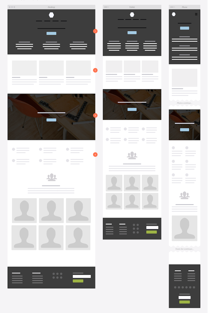
Wireframes allow you to demonstrate more detailed layouts before moving to visual design such as colors, type, photography, and icons. While it’s often unnecessary to wireframe every page of a website or app, it is useful for key pages and functionality. The level of detail needed in wireframes will vary based on the project, as you can do anything from simple sketches to full-size high-fidelity mockups. Regardless of the type of wireframes, they can help to establish:
- Content hierarchy
- Page layout
- What is included on a page
- The relative size of elements
- The primary actions for users
In a client project, wireframes can serve as a timesaver, getting sign-off on key concepts before spending time on precise layouts and design. Rough mockups can quickly be created and revised before moving ahead with the process.
Wireframes can also demonstrate responsive layouts to developers. Quick mockups of how content shifts or stacks on mobile devices can be created using kits such as UX Kits Responsive Wireframes. The wireframes in this kit are also smaller than a website’s actual size allowing focus on content instead of precise sizing and spacing, which can be tackled later.
 When creating wireframes, consider the following:
- The less design detail, the more focus on function.
- Consistent elements, such as navigation, do not need to be detailed on every page. Show them once (likely on the first page of a website or app) speeding up the process of creating and editing wireframes.
- A single wireframe can represent multiple similar screens or pages.
- Blocks of type can be represented by simple lines or lorem ipsum. Actual text can be a distraction.
- Photos can be represented by boxes. Add a camera or photo icon for clarification.
- Icons can be represented by circles or other shapes.
- Smaller wireframes are often easier to follow (and quicker to create) as they provide a full snapshot in less vertical space.
Like with flowcharts, you can keep a standard set of wireframes handy for similar projects and modify them as necessary.
3. Enhancing with style guides
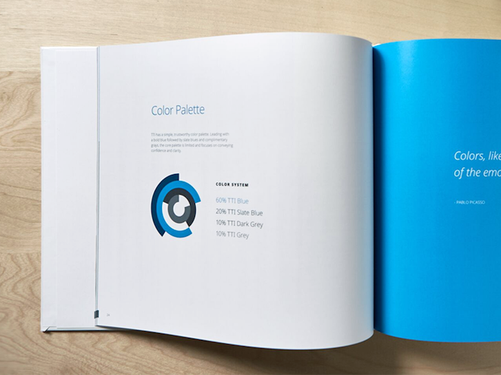
A style guide provides a visual framework for an entire product. Whether you have detailed wireframes, simple sketches, or nothing at all, an app or website will eventually need a look and feel. Rather than design every single page, a style guide contains consistent design rules for typography, buttons, icons, spacing, and any other visuals. A style guide goes hand-in-hand with wireframes and prototypes as it puts a layer of design on top of whatever you are creating.
Much like with flowcharts and wireframes, a style guide is a powerful tool for client work. They allow clients to see an overall design picture in one document. The style guide also gives the client something to refer to for future projects , from their letterhead to advertisements to videos. For this reason, remember to keep a style guide up-to-date.
In our process at our design studio, Eric Miller Design, we often create a style guide at the same time a developer is building a prototype and eventually the two are merged. Developers can use wireframes or frameworks to create the first version of a product, while a style guide is created separately. This reduces timelines as the product can be created with a focus on UX and styled visually later.
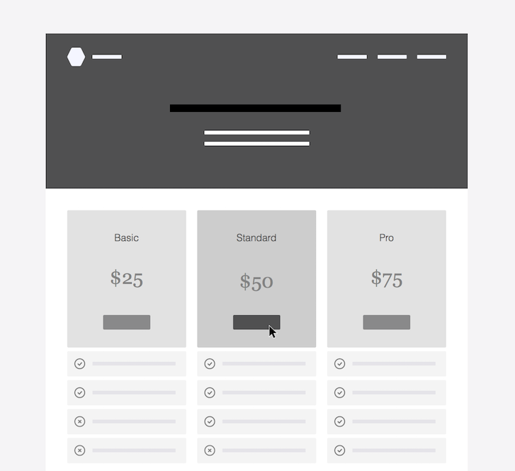
For a Shopify site, a style guide would outline the design of action buttons (i.e. Buy Now), sizing of product photos, type for titles and descriptions, and more. A style guide should also document some interactions such as the mouse-over color of a button.
The style guide below was designed by Focus Lab for Sidecar and is available as a printable template. 
You might also like: A Quick Guide to Getting Started with User Experience Design
4. Showcasing with prototypes
Prototypes are working models of products designed to test and prove a concept, sometimes containing limited or partial functionality. The documents created earlier can facilitate the creation of the prototype. The flowchart is the model for what pages need to be built and how they are connected. The wireframes provide detail for individual pages.
While communicating with the development team is necessary throughout the process, handing off these approved documents to them will give them guidelines and something to refer to when collaborating. This is especially useful when partnering with offsite freelancers or agencies.
Your wireframes can also serve as the actual pages for a prototype. Rather than focusing on design, the wireframes can contain all the necessary elements, and nothing more, for creating a test version of a website or app. Fully designed pages or UI kits in a prototype can incidentally shift focus away from making sure a product works before it looks good. By using wireframes as your prototype pages, you can get feedback such as “would that button be more effective in a different location?” instead of “why is that button blue?”
For smaller projects, such as a standard ecommerce site using a theme, the prototype phase can often be skipped. For more complex ones, a prototype is crucial, especially for client feedback. It should be expected that clients will approve several deliverables only to suggest changes in a prototype, as the prototype allows the client to interact with the product for the first time. Changes in the prototype are generally much easier than in the development phase, saving everyone time and money.
You might also like: 5 of the Best Prototyping Tools to Test Out Your Web and Mobile Designs.
The “Final" Product
“Final” is in quotes here because for a website or app, there’s really no such thing. But, for the purpose of this article, we’re talking about the product you have at first launch. As the person who created the flows, wireframes, and maybe even the style guide and prototype, you have a continued responsibility to make sure the integrity of the product is maintained through completion. This means:
- Reviewing the product for consistency in design and function.
- Tweaking design and interactions.
- Flexibility and compromise when it comes to pixel-perfect design versus real-world functionality.
- Considering budget and timeline when making decisions and change requests.
With all the work you put into creating your planning documents, it is also important to know when to leave them behind. Many revisions will occur during prototyping and development, so it is generally unrealistic (and unnecessary) to maintain updated wireframes. In our studio work, we’ve found it is useful to maintain a flowchart as a “ruling” document and to stop updating the wireframes sometime during early prototyping.
What to deliver and when?
Now that we’ve covered some different types of deliverables, let’s rewind to the beginning of a project and determine how you decide what needs to be created.
When starting on a project, discuss with the team what types of deliverables work for them and what steps will be taken to finish. As the web or UX designer, some project management falls on you to work with the team to be sure they understand what needs to be built. To verify that they do, ask the following:
- Who is part of the approval process and what are their expectations?
- Will a prototype be created?
- What platform will the prototype and product be created on?
- What documents are most useful to the development team? In what format?
- How will you present deliverables? By screen sharing, in-person meetings, email or another method?
- By asking these (and more) questions you can determine if you will need flows, wireframes, a style guide and other documents to best complete the task at hand.
Summary
Remember that every project is unique. Determine what tools to use based on the type of product, complexity of requirements and personalities you are working with. Sometimes extra planning is needed at the start to make sure there is a clear path, while other times going straight to prototype with napkin sketches may be the best route to success.
Read more
- Client Collaboration: 8 Tips to Deliver Successful Projects
- 8 Quick Tips for a Bulletproof Freelance Contract
- Get to the Heart of Your Clients' Ecommerce Dilemmas With the 5 Whys
- Sketchnoting 101: Tips For Improving Your Visual Vocabulary
- 3 High-Impact Tips for Designing an Ecommerce Site That Converts
- Internationalization: Practical Tips to Build for a Global Audience
- 5 Common Digital Content Problems and How to Avoid Them
- UX Designers: Are You Focusing Too Heavily on Creating a Beautiful UI?
- Shopify's Mobile Device Testing Lab Gets Wheels
- Content Strategy: The Principles we Followed to Build the New Shopify App CLI

 Powered by Gleam