According to Ultrascan, $12.7 billion was lost to Nigerian prince scams in 2013. While that number sounds a little high to me, that’s not a good sign even if the truth is a fraction of that size. While Moe falling for a variant of the Nigerian prince scam on The Simpsons makes for entertaining TV, fraud is anything but a joke.
This type of deception causes trouble for ecommerce. Business Insider reports that fraud cost ecommerce retailers $32 billion in 2014. Moreover, estimates say U.S. retailers lost 1.3% of all revenue due to fraud in 2015 — which is more than double the 2014 rate.
Sometimes, it’s not an actual scam — but the final product falls so short of the promise it’s just as unfair as comparing a Big Mac in a commercial to the one you get at a restaurant.
May great businesses have been built on social platforms like Facebook (like this one!), which drives its fair share of social network advertising online (in 2015, it owned 65.5% of social network advertising). Unfortunately, some shadier ones take advantage of it as well.
This doesn’t just happen to visitors who are laggards and late adopters. This Macworld columnist got three different credit cards stolen across just a few months. And let’s not even get into the identity theft that can take place starting from stolen credit cards.
It’s easy for us, people who probably deal with high volumes of customers and are familiar with ecommerce, to offer a Kanye shrug and point to this as an inevitable byproduct of high growth rates.
But whether as an industry, or as individual stores, if we’re to meet this projected growth, we have to solve the problems that come along with it.
The stores that do will reap the rewards, the ones that don’t will tank because they lose customer trust and create negative customer experiences.
Ultimately, building great customer experiences is crucial to all ecommerce companies. As my friend Corey Eastman writes, customer experience is crucial to Amazon’s growth “flywheel” — they focus on customer experience as the fundamental element that fuels the rest of their growth.
While people are excited to buy things online, when it comes down to the decision to check out, they also wrestle with a lot of uncertainty and fear. Making your store reputable means more than just putting up a Verisign badge or logo at the checkout page. It doesn’t just apply to a high consideration zone like checking out, but to the entire experience. The checkout is the culmination of that.
Here are five fears that are top of mind when a customer is checking out, which can also be seen as rich opportunities for you to earn visitors’ trust. After all, these are potential buyers and future loyal customers. You will clear any confusion, communicate messages that enable them to wrestle with their own fears and uncertainty, and put them in a position to make a decision they’re satisfied and comfortable with.
1. “Can I Find a Better Price?”
A couple of years ago, I visited one of China’s infamous “fake malls.” There are two things unique about these malls:
- All the merchandise were — as the name suggests — bootleg.
- All prices are negotiable.
The actual experience was fascinating. I was no expert negotiator, so it gave great insight into the process. I remember hesitating about haggling, wondering, “Can I haggle them lower?” Once I did, I would be thrilled…
Until I found out my friend got a better deal.
Nobody likes thinking they missed out. On the internet, the possibilities are endless. With ecommerce, there’s a bit of fear of missing out (FOMO) on a deal. What if the item goes on sale next week? Should I wait until Black Friday or a seasonal event?
Conversion optimization consultant Jeremy Smith writes that these types of price-related questions are particularly important to price-conscious visitors, but I think it applies to a large portion of general visitors. After all, we probably all know — to some degree at least — the regret and remorse of having overpaid, missing a coupon, or buying just ahead of a sale.

This is exceptionally true, especially upon seeing a coupon code box in the checkout process — which prompts the question, “Was there a coupon I missed?” (We won’t go deep into coupons here, as coupons are an entire topic on their own.)
Many people have always been price-conscious. People don’t want to spend more than they have to! After all, Wal-Mart, the largest retailer at the time of writing, built its business model on low cost positioning.
How to Reassure Visitors and Overcome Pricing Fears
There are plenty of ways retailers have convinced visitors that pricing will not be a concern. The most prominent way to do this is to offer to match prices from other retailers at the time — or, potentially, from your own store for a certain time after purchase (e.g., if the product price drops at the store 30 days after someone buys it, you will match that price).

JackThreads offers a price guarantee. In fact, they offer a TryOuts program, which ships products to visitors to try for 7 days without paying, which is a great way of showing the visitor that JackThreads is trustworthy.
The visitors sends back whatever doesn’t work (on JackThreads’ dime), and JackThreads also offers a price guarantee: “If any items change in price during your TryOut, we'll guarantee you the lower of the two.”
It sounds unaffordable at first glance, and it probably very well is. But if someone in your industry offers these types of price matches, you have to at least consider how else you can outlast their spending on price matches. Sometimes, it’s just an endurance race — and if you want to compete and acquire customers, you may not be able to afford not offering them.

Image source: VWO
You could also offer a money back guarantee for buyers who aren’t satisfied with the product. In a website update, UnderstandQuran.com implemented this satisfaction guarantee along with an iPhone app icon. Their sales increased by 32.57%.
We briefly mentioned coupons earlier. Coupons are key to growth and persuading some visitors to buy, so we’re definitely not suggesting that you get rid of coupons entirely. However, you can make the coupon fields a bit less apparent. Baymard Institute discovered that during checkout, users pay a disproportionate amount of attention to empty form fields.
When some of the more resourceful visitors see an empty coupon field, they leave to find a coupon. After all, it takes less than a minute, and could save them xx% on their order. Why not?
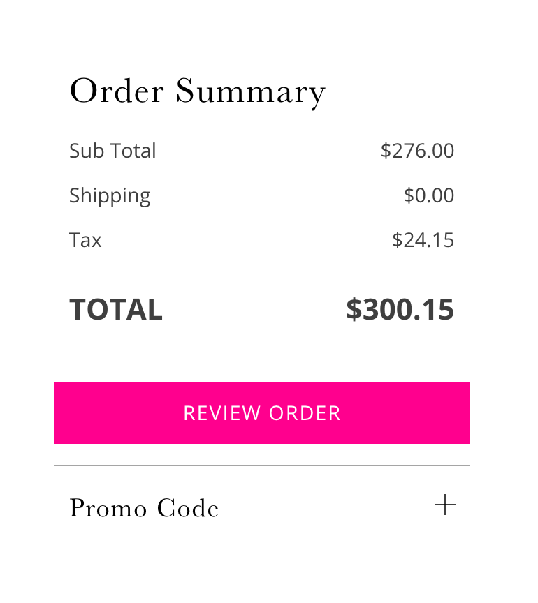
Baymard discovered through eye-tracking studies that users nearly always pay attention to form fields on the page, but happily ignore graphics and text blocks. In order to avoid tempting visitors into going “coupon hunting,” hide your coupon code fields behind a link. When a visitor who actually has a coupon code sees and clicks this link, the page will review coupon form fields inline on the page.
2. “When Will My Shipment Arrive?”
Nobody likes paying more than they’d expected. This is the opposite of lowballing — when someone offers a bid much less than the perceived value of the product — but it’s equally annoying. Imagine putting a $25.00 pair of pants in your cart, only to find that shipping and handling brought the total to $60.00. Ugh! Get me out of here.
People hate additional costs. According to ReadyCloud, 61% of abandoned carts are because of shipping and handling costs. Business Insider’s stats from 2014 are slightly different, but still puts shipping costs as the top reason people abandon their shopping carts.

When you don’t make shipping certain, you confuse the customer. You don’t make it clear why they should trust you. How can they — when they don’t have an idea of how much they’re going to pay?
At other times, shipping options and prices are clearly listed in the checkout, but the actual shipping duration and arrival dates simply aren’t very clear. This time estimate is particularly important if the product will be a gift, or if it’s needed in time for a certain event. If you were shopping, you wouldn’t want to ask the website “When the heck is this thing going to get here?!”
Understandably, your visitors wouldn’t either.
How to Reassure Visitors and Overcome Shipping Fears
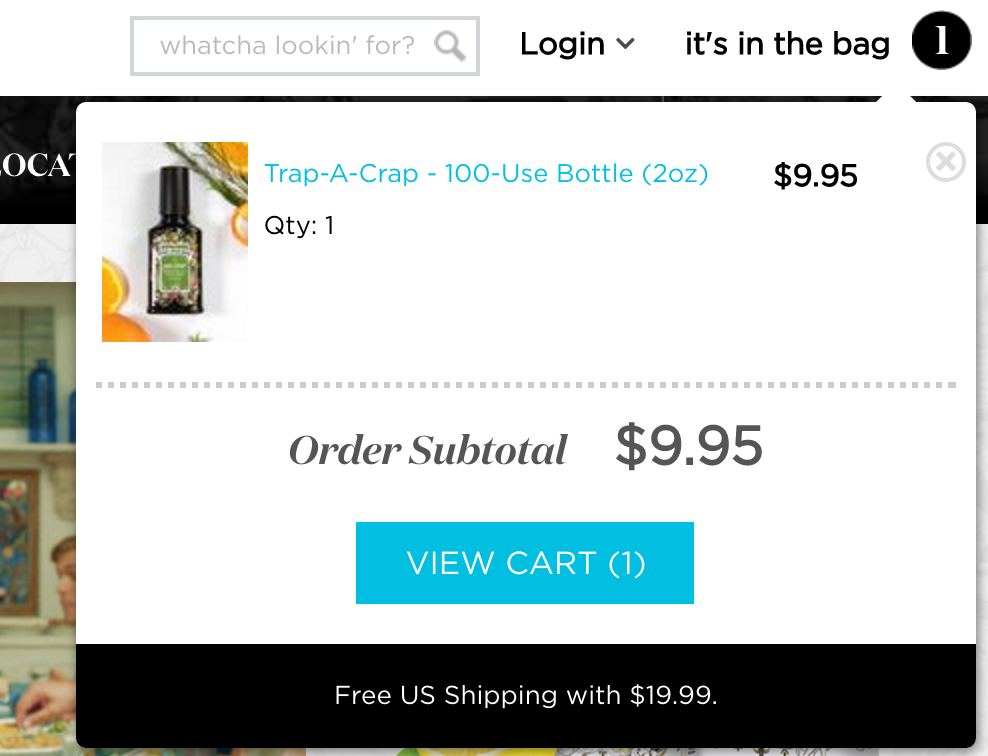
One of the most widespread ways of reducing shipping fears is to offer free shipping. More specifically, you could make an offer to all visitors to provide free shipping if they make a purchase of a certain size. Jeremy Smith estimates that free shipping is a major incentive for 73% of online shoppers.
Be specific not just with shipping option names (e.g., “Ground shipping,” “Super shipping,”), but with actual arrival dates and prices.
In order to make the shipping period less anxiety-inducing, offer order tracking for your buyers. Or, offer cash on delivery as an option — so that visitors know they won’t have to part with their money until the item is delivered. (Cash on delivery could also make a great solution for pricing fears.)
3. “Why Do You Need My Data?”
Data is essential to great customer experiences. With data, you can personalize shopping options, customer service and support, and get smarter with your ecommerce experience.
As such, companies collect a lot of information, but they fail to clearly communicate to the visitor what it’s being used for. Baymard Institute calls this “seemingly unnecessary” information, and discovered that 61% of the largest e-commerce sites in the US asked their visitors for such information.
According to Forrester Research (via Elastic), 23% of shoppers will abandon their carts when they’re asked to register before checking out.
Look, this fear makes a lot of sense. Visitors don’t want to lose their personal or credit card information. Ecommerce has already proven to be leaky in the past — even Amazon can be vulnerable to hacker attacks. This type of exposure is why most millennials believe gift cards to be the safest payment option.
How to Reassure Visitors of Data Fears
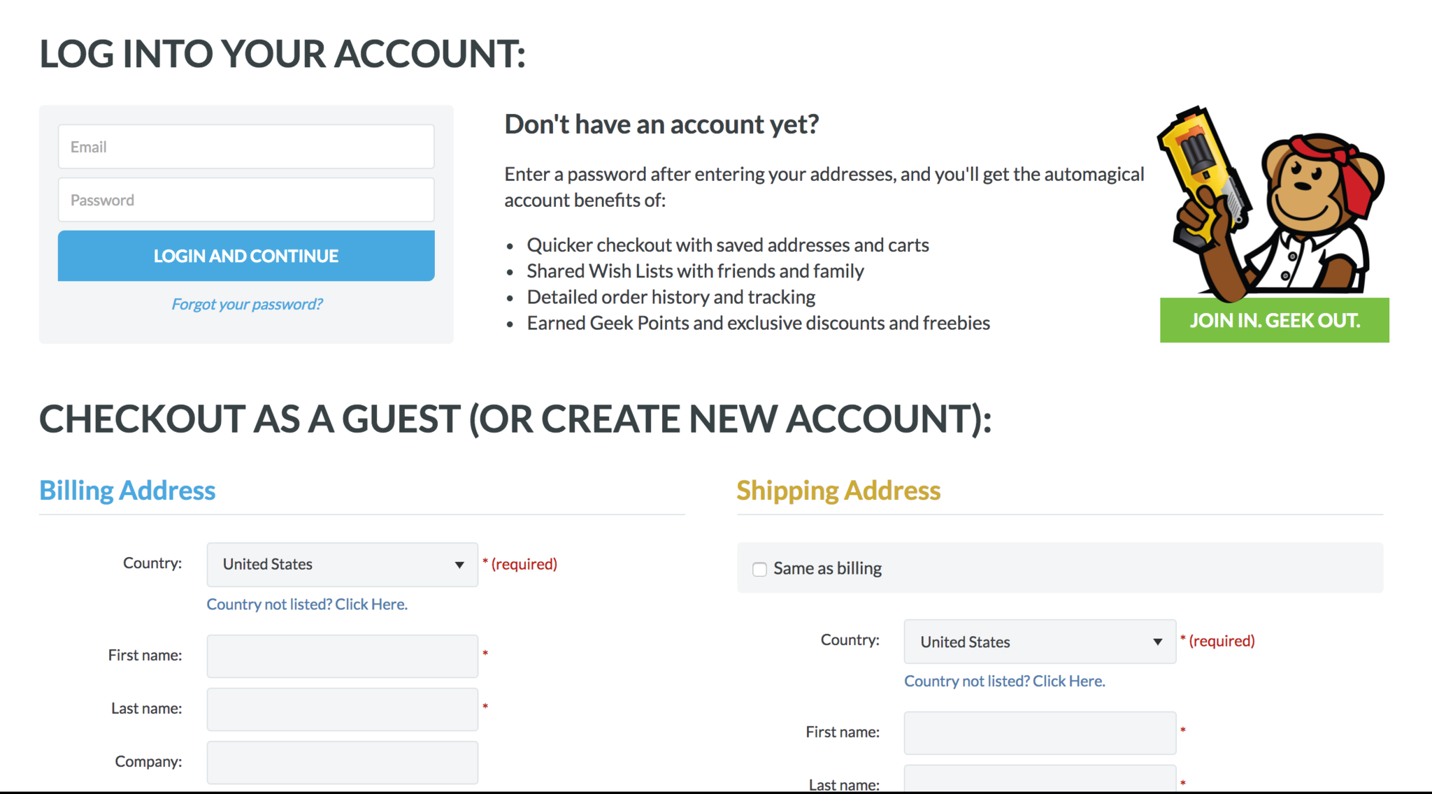
Obviously, you can start by not forcing visitors to register before they checkout. Jeremy Smith wrote that a retailer boosted conversions on their site by 29% simply by adding a guest checkout (no registration) option to their site. Don’t hide this option — make it prominent and clear that visitors can checkout as guests if they like.
When you’re collecting data from visitors, you can also explain the benefits or the reason why you’re collecting data. People are generally very susceptible to the word “because.” Let them know why you need data like their phone number (e.g., so the shipping and handling company can contact them, etc.), and they’ll be much more at ease.
A study by Harvard psychology professor Ellen J. Langer published in the Journal of Personality and Social Psychology showed that people need a reason to do things. In three situations, participants were given three different reasons someone needed to cut in line:
- No reason: “Excuse me, I have 5 pages. May I use the Xerox machine?”
- Real reason: “Excuse me, I have 5 pages. May I use the Xerox machine, because I’m in a rush?”
- Fake (placebic) reason: “Excuse me, I have 5 pages. May I use the Xerox machine, because I have to make copies?”
Despite the fact that fake reason wasn’t legitimate, people were almost as willing to let people cut in line when they heard the fake reason as they were with the real one.
The Baymard Institute also discovered that more “robust-looking” pages and elements are perceived to be more secure. The write, “visual clues such as background colors and borders can help increase the user’s perceived level of security.”
Of course, adding logos to the checkout can help enforce a certain level of trust. But remember, building trust is a part of the overall customer experience — slapping on a couple of images won’t save a site that sends the wrong messages to visitors.
4. “What Will I Do if Something Goes Wrong?”
There are dozens of things that could go wrong with an ecommerce experience that makes things a bit more complicated than simply walking out of a store. The order could get mixed up. The delivery could be late. The product might never arrive, or might be of lower than promised quality. The checkout process could confuse them, or they might have doubts.
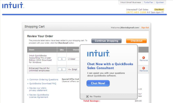
Image source: ProImpact7
As it turns out, 76% of people who use live chat actually do so mainly because they experience errors during the checkout process. That’s a lot of people who might’ve abandoned carts simply because of friction.
It might be their first time shopping at your store, or they might’ve had trouble with other ecommerce stores. Either way, people want to know what they’re going to do if something goes wrong — will you be available and reliable if they turn to you, and will they be able to trust you?
How To Reassure Customers and Overcome Unpredictability
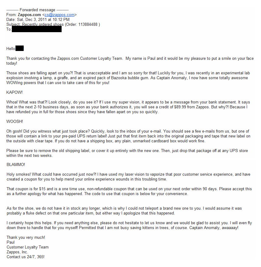
Image source: Helpscout
Talking about great customer service is not enough — you must show your company’s dedication to it. Zappos.com, now a division of Amazon, is famous for its customer service (here are a few of the many stories). This starts with support from the top and aggressively using customer support as a differentiator and competitive advantage.
One way to show your support team’s responsiveness is to make them available via live chat and phone. Simply adding live chat increased Ez Texting’s conversion by 31% over the original design.
Moreover, you must also make your returns policy clear and lenient. A study conducted for UPS by Forrester Research (via Internet Retailer) discovered that 81% of consumers are more likely to buy from ecommerce retailers with easy and user-friendly returns policies.
Let people know that you take their trust and money seriously — enough to give it back to them if they don’t think you’ve lived up to their expectations.
5. “Did I Miss Anything? How Long Will This Take?”
Paperwork is a pain in the neck. And you might not have form-o-phobia, but if you do your share of shopping online, you know the pain of filling out a long set of forms — no matter what the product is.
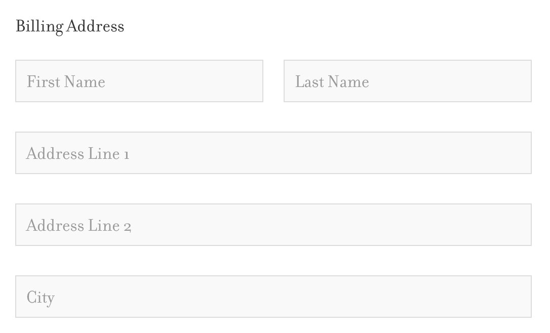
Some particularly poorly written and designed forms are ambiguous. For example, did you know a lot of people are stumped by fields marked “Address line 2”? (Users might wonder, “What does this mean — Should I enter my PO box, my unit number, my street address, a C/O address, or something else in line 1 or 2?”)
These careless errors either poorly communicates the meaning of a requested form, or doesn’t communicate it at all.
You can’t expect your visitors to go through a trial-and-error method to fill out your form. After all, people don’t like getting things wrong. If you only let them find out after having them fill out the entire form that something went wrong, they’ll feel frustrated, and it’ll take away from the customer experience.
Instead, you should do your best to assure them that they’re doing fine — and give them feedback right away.
How to Reassure Visitors and Overcome Their Fear of Forms

You can use captions following the questions, but above the fields, in the form to better suggest what kind of information you want from the visitor filling out the form. You could also write up safe-to-follow examples in the caption. For example, here’s what Baymard Institute suggests doing instead of writing “Address Line 2”:
“The “best practice” implementation of this is to provide an additional label description and input examples either in direct conjunction with the field label or below the “Address Line 2” field itself. Typically in a secondary smaller and greyed out font, specifying that this is the place for “Apartment no., C/O addresses, floor level, Att., PO box, etc”. Meanwhile the placeholder text can be used to provide actual input examples (e.g. “Chestnut Street 2125”).”
As mentioned earlier, you can also use captions to explain why you want customer data.
Instead of bringing up a form error after a visitor fills out a checkout form incorrectly, you should verify the information right after they fill out the form. This type of validation is not only more convenient for the visitor, it also increases their confidence and helps them build momentum through the checkout process.
A small survey saw a 22% increase in success rates, a 31% increase in satisfaction rating, and a 42% decrease in completion times when a site implemented inline validation.
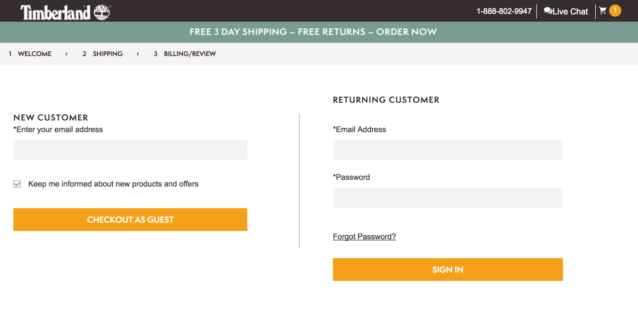
If the form is a long one, or if it’s a visitor’s first time shopping with you, you should split the form into smaller steps. Online marketer Bryan Eisenberg recommends using no more than four steps, and conducting split path tests (which alters the sequence of forms a visitor sees).
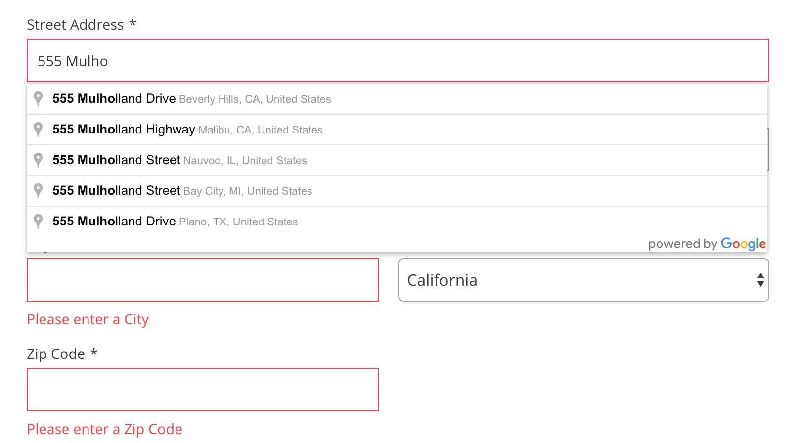
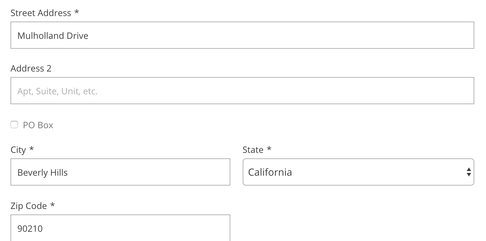
You can also make the form more convenient by using autocomplete or anticipatory forms wherever you can. For example, Free People anticipates addresses as a visitor types it in, and fills out the city and country fields on the user’s behalf. If you’re going to do this, make sure your anticipatory form is as accurate as possible.
Final Thoughts
Creating a great customer experience starts way before the checkout page. But, the culmination of the shopping experience is at the checkout page — make sure you remind the visitor that you’re to be trusted and to assure their fears as they’re about to make the big decision.
There are a lot of scams out there. Ensure that your visitors, buyers, and customers know that you take their trust seriously.Read more
- Gift Wrapping in Ecommerce: How to Boost AOV This Holiday Season
- How to Reduce Post-Holiday Returns
- Why Leading Indicators in Ecommerce Are the Key to Success & How to Find Them
- How Ecommerce Teams Get Buy-in To Sell More
- How to Monetize Dormant Customers With a Successful Winback Campaign
- How to Block the Ad Blockers & Whether You Should
- Customer Retention: How to Turn New Shoppers into Repeat Customers
- How to Personalize for Unknown Black Friday Cyber Monday Mobile Visitors
- How to Overcome Your Daily Operational Frustrations to Focus on Future Growth
- How to Create a Brand People Can’t Forget: Purple Mattress on Product, Voice, and Culture

